|
An Urban Area is the region surrounding a city, however it can also refer to towns, cities and suburb. Most inhabitants of urban areas have modern, office jobs. Urban areas are very developed, meaning there is a plethora of human structures such as houses, commercial buildings, roads, bridges and railways.
|
"City Life is millions of people being lonesome together." - Henry David Thoreau "The city is not a concrete jungle, its a human zoo." |
Initial research
london shoot
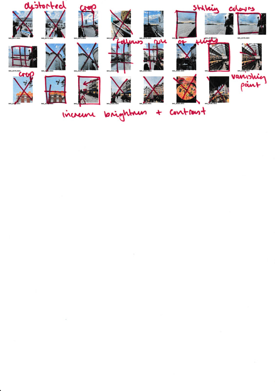
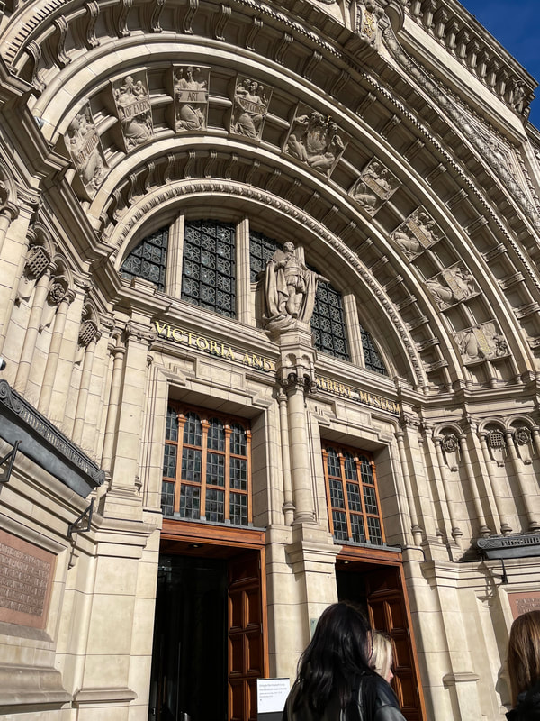
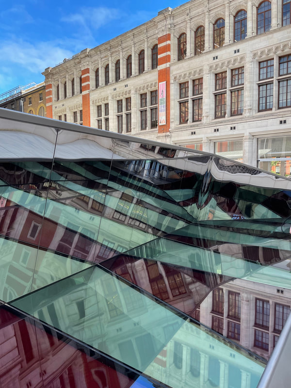
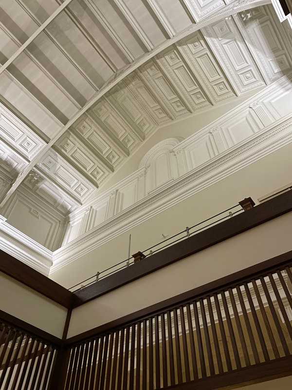
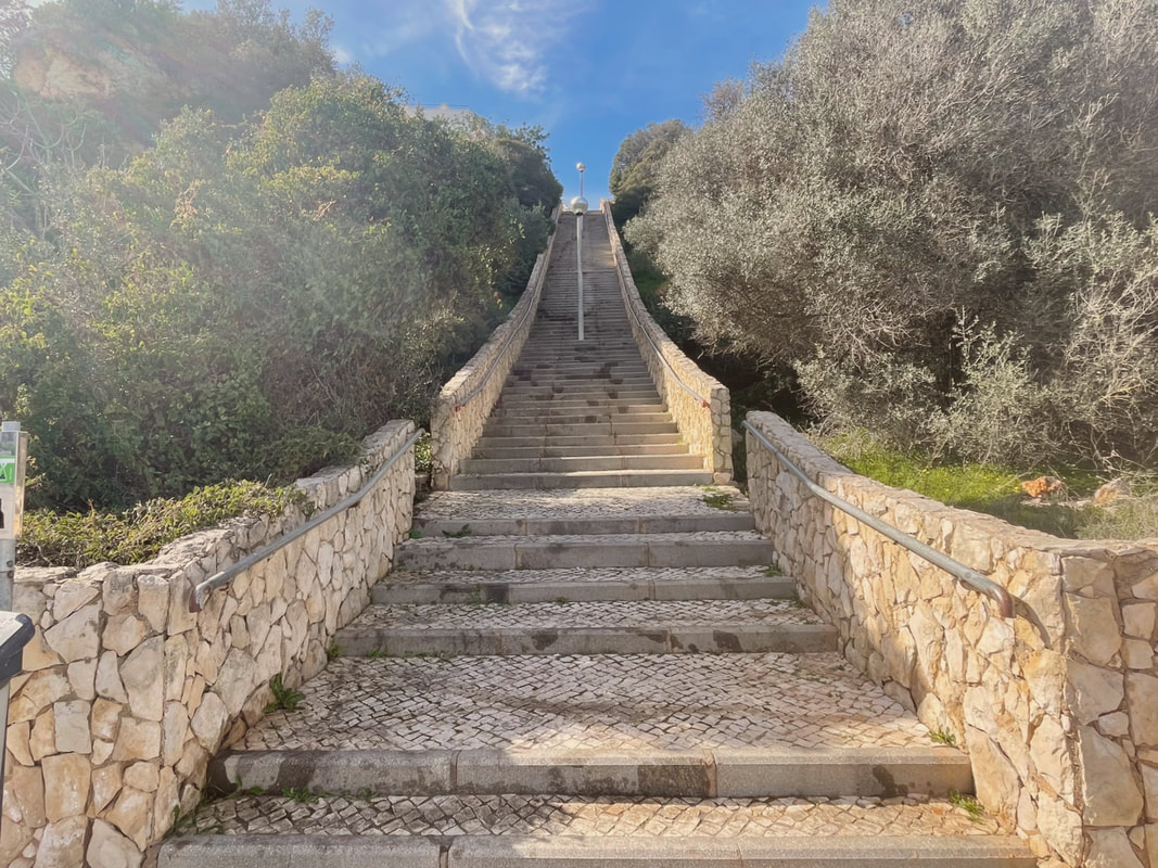
To aid my understanding of this genre, I first went to London to take photos and explore. While I was there, I first went to The V&A followed by the Tate Modern. The V&A was both spectacular and intimidating with the extensive collection of artefacts. Tate Modern held a much more modern collection, as the name suggested. The artwork and architecture was inspiring and I toughly enjoyed my experience. After Tate, it was beginning to become late and we ventured through Covent Garden to Leicester Square where we had a meal. Thankfully, the weather was kind to us, even in October. For this shoot, I felt taking an expensive camera to London would not be the greatest idea, so I opted to use my iPhone 12 instead. As I was spending a whole day in London, I would be taking images at different times of the day. This was a benefit of using a phone rather than a camera - they are easier to adjust and use than larger, complicated cameras. I didn't have any props for this large shoot; I used the world around me to gain ideas and inspiration. My shoot locations also changed as I moved through London at a brisk pace. This allowed me to experiment with different angles, colours and textures.
contact sheet
best images
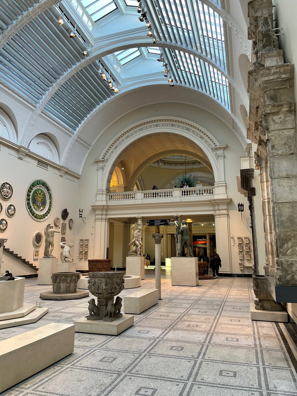
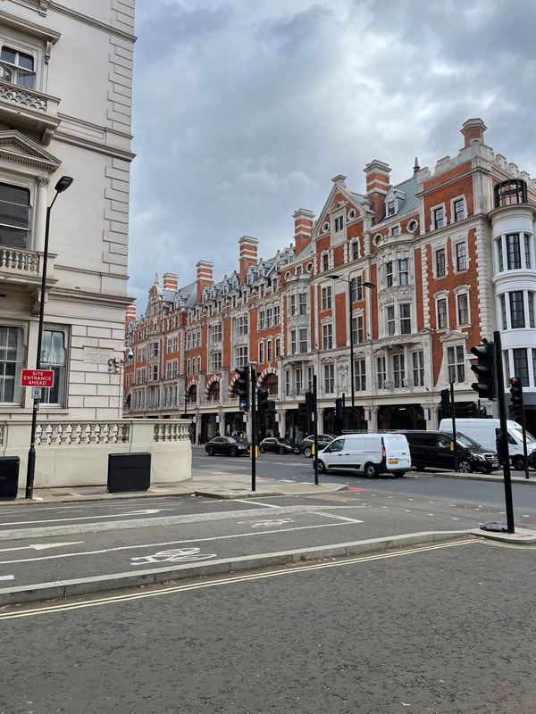
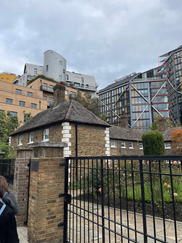
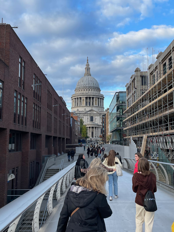
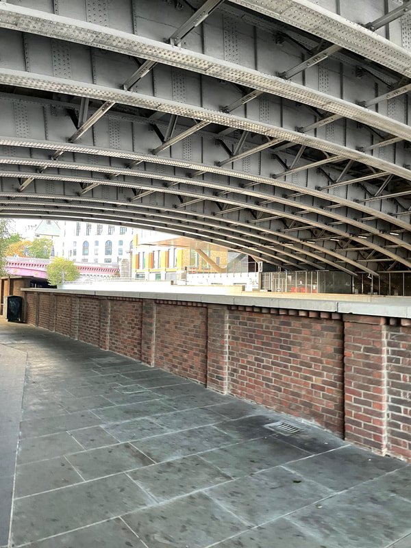
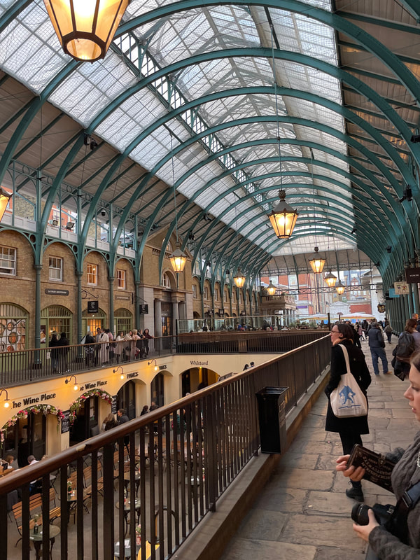
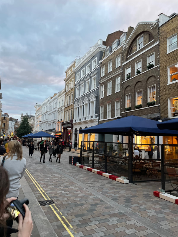
I feel London is a brilliant area to take photos and explore architecture as it combines both the old and the new into one area. Places such as Covent Garden and Leicester Square are rich in culture and history, making them great areas to explore what 'Urban' could mean. London is special because of its Old and New blend. In some areas, they seamlessly fit together like it was always there. This shoot helped me to understand form and line in urban landscapes too. Overall, this shoot was beneficial to my learning and understanding as a photographer. I will definitely be using key skills I learnt on this trip in further work.
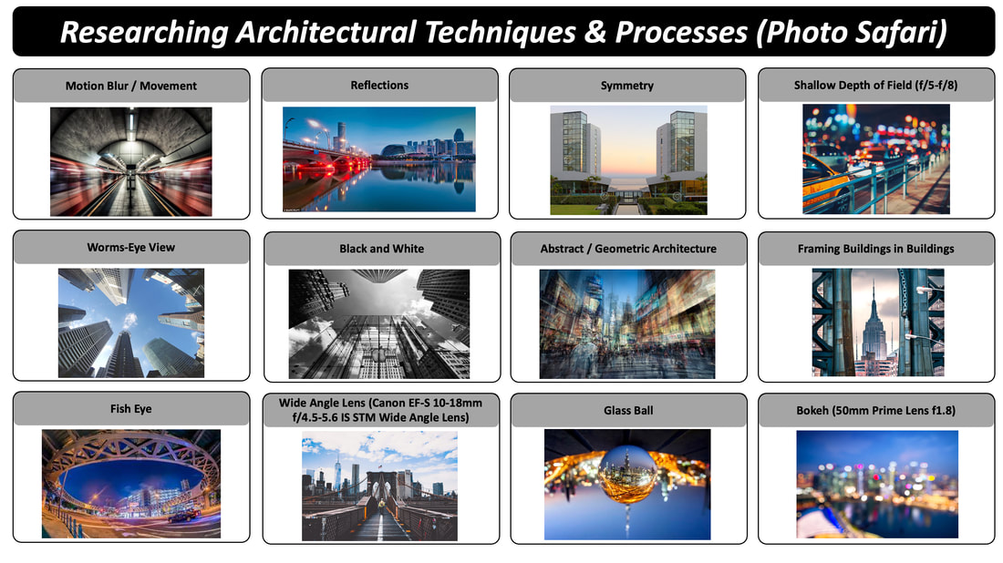
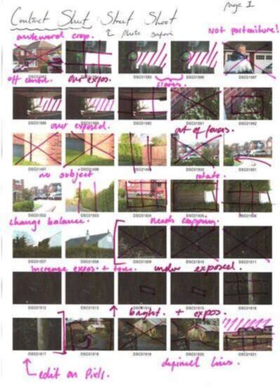
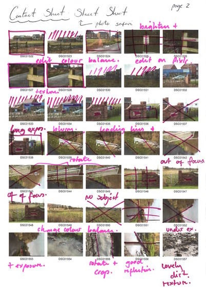
Photo safari
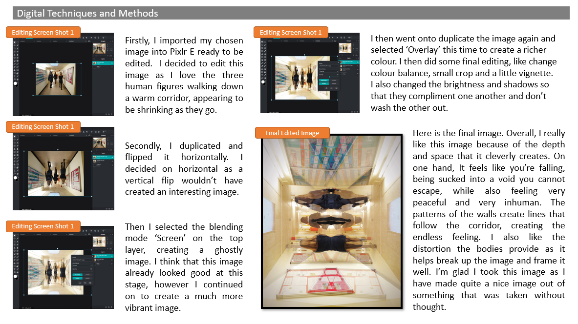
To start this photo safari, I researched some images which fit the prompts. Looking for these images allowed me to see a wide range of work by different people with different styles. Harnessing these styles in my later work will help grow my style and work. Using these examples, I later went out into my own school to find ways to recreate some of these techniques.
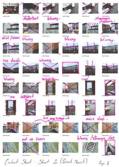
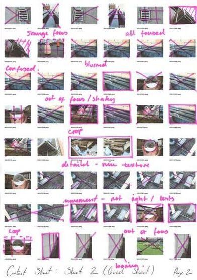
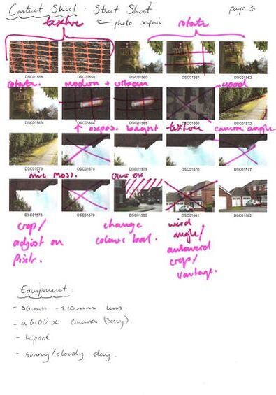
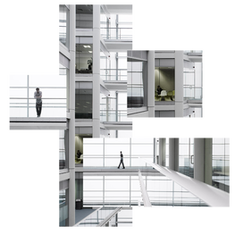
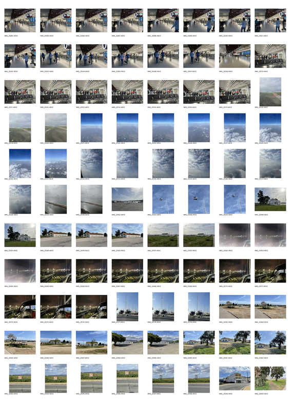
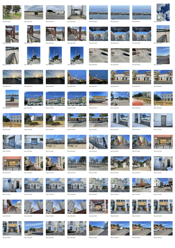
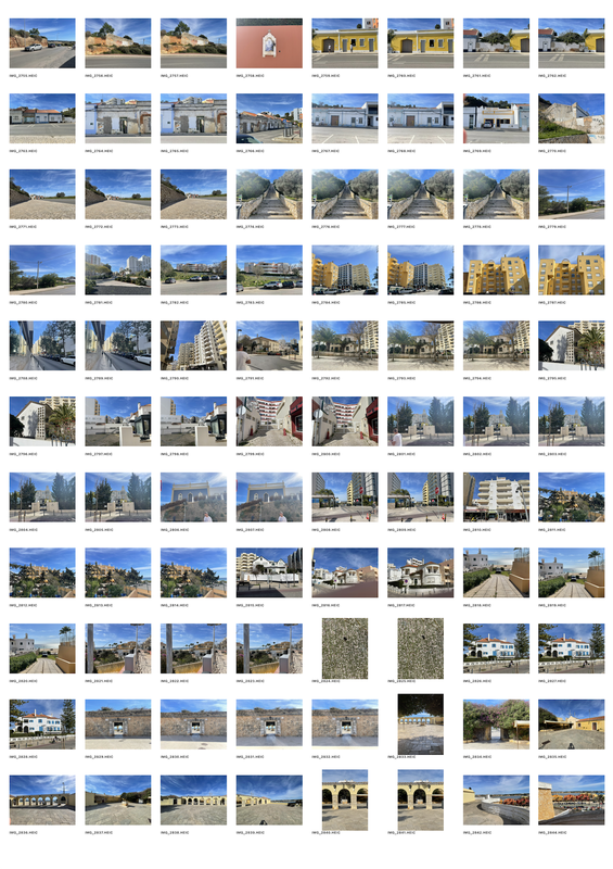
After completing my 3 school shoots (car park, the quad and halls), I looked around my own street finding interesting images to use for this photo safari. I was able to catch some unique images, all benefitting my learning and understanding as a photographer. Following is the collection of my contact sheets, editing processes and final images which I later use to create physical outcomes.
school quad / car park shoot
|
|
|
|
school halls shoot
|
|
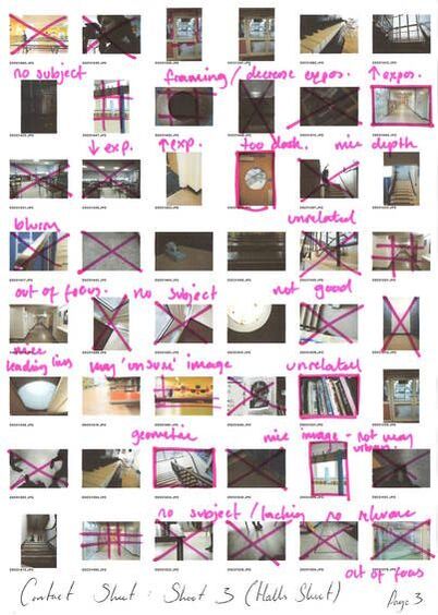
|
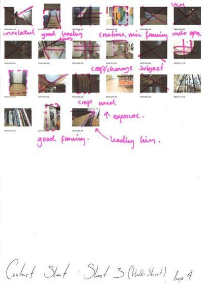
|
home street shoot
|
|
|
Best images
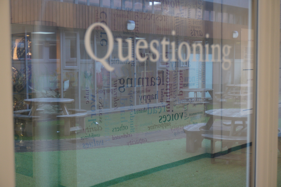
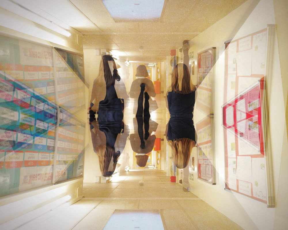
I quite like this image as I managed to create a similar effect as the one Pedro Correa uses in his work - a natural double exposure. I really like that through the glass you can see a reflection of the words on the opposite wall. If I were to edit this image, I would crop it and up the brightness to highlight the words, also increasing the contrast to create a moodier image.
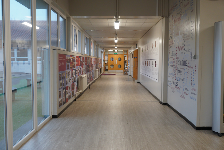
Once again, I like this image as it creates the feeling of distance. Not only with the narrow halls, but the doors at the end, small and unreachable. The windows on one side and the wall on the other also adds to the feeling of being trapped somewhere. When editing this image, I would darken the shadows and maybe reduce the brightness, increasing the contrast a little.
|
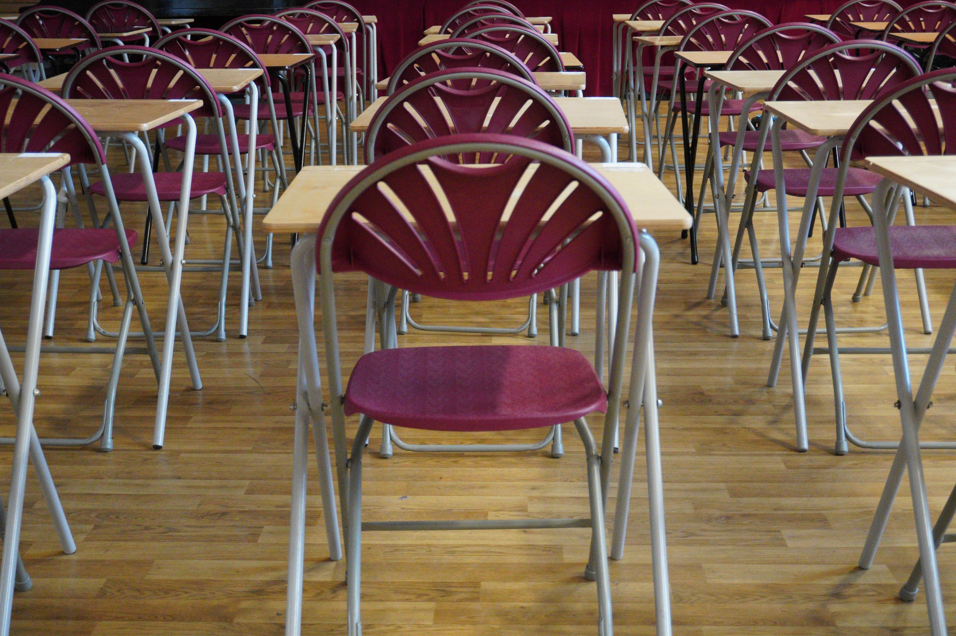
I really like this image as it shows exam desks laid out for GCSE mocks. Although this image brings be a level of fear, I like how the rows move away from the centre of the image, leading the eye upwards . I also like how the line of chairs and tables turns and changes angles, as if imperfect. If I edited this image, I would darken the edges and brighten the rest of the image.
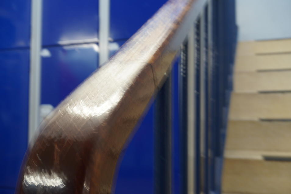
Finally, I like this image too as although it was unintentional, the blur creates a feeling of movement within the image. This blur can mean many things, such as dizziness and nausea, or speed and confusion. TI like this image as anyone can have an opinion to its meaning. If I were to edit this image, I would reduce the contrast somewhat and bring down the brightness.
|
digital edits
FINAL EDITS
best edit
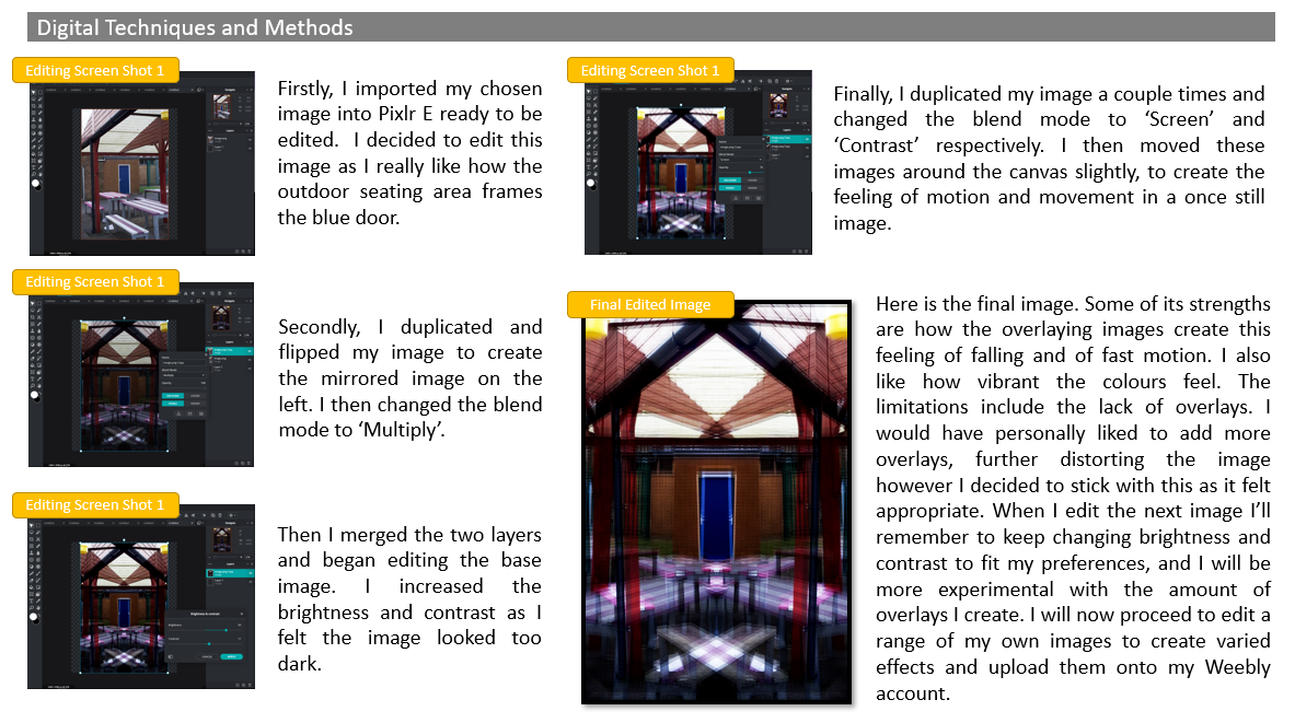
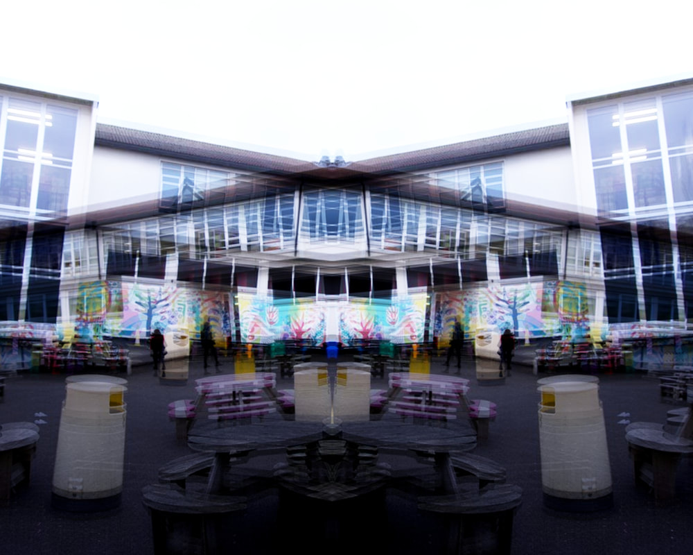
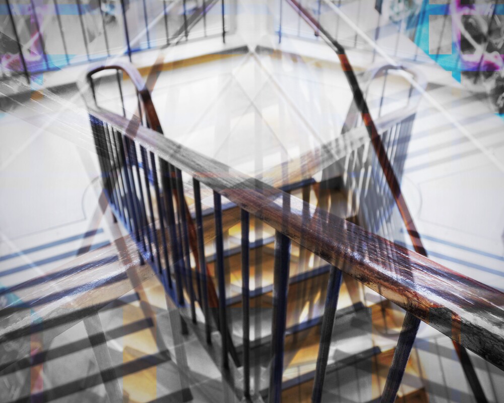
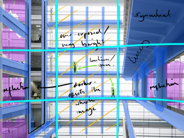
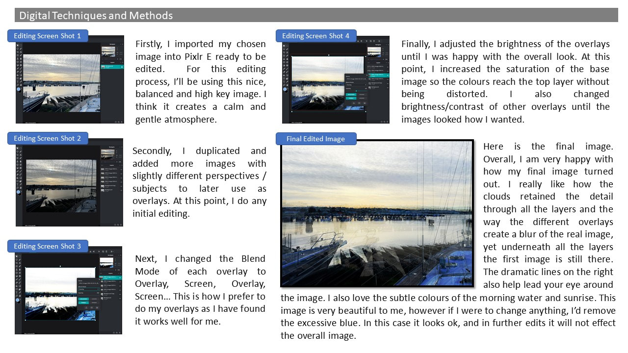
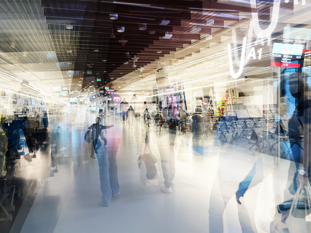
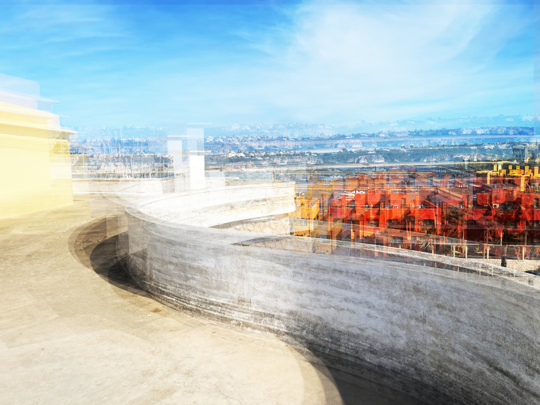
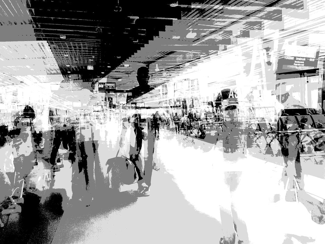
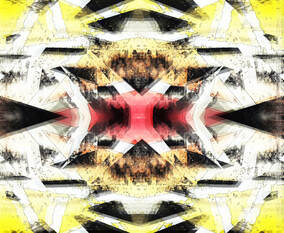
Out of all my images, my favourite has to be this one. This image was taken and edited by myself. The genre is urban landscapes. I didn’t us props, however I did ask my friends to walk ahead of me so I could photograph them.
The composition of this image follows the rule of thirds, as my friends are found in the central third. They are also in the middle ground of the image, walking towards the far background. The viewers eye is led around the image by the angular lines and unique forms of the image. The perspective is from around chest height. I employed a range of visual elements including line, colour, form and space. For the lines, the reflections paired with the existing perspective creates a unique mix of lines leading everywhere and nowhere. I also like how the colours came out, very warm yet unnaturally bright, as if the place it was taken in was unnatural. Furthermore, the forms also morphed to form strange results, for example the reflected bodies paint striking forms across the centre of the image, Lastly, I employed space to create a never-ending atmosphere to the hall, as if you’ll never reach the end.
This image was taken from a moderate distance away from the subjects, cropped to bring them to the centre of the image. The main focal point is also focused on the three subjects. The viewers eye is led not by the subjects, but the angular lines surrounds them. Beginning at the foreground, venturing down to the middle and then background. The image has been taken with artificial light, however it has been edited to make the light overbearing and difficult to imagine. The light source is above the subjects, lighting the whole area. These methods create a very uneasy atmosphere where things are right.
I wanted to create this image as I like the unnatural in a seemingly natural space. Although the image seems energetic, I feel it becomes calming after a while due to the warm, yellow light. I think this image fits very well with the idea of urban landscapes and has greatly helped with my understanding of the genre as a whole. I strive to create more images like this one.
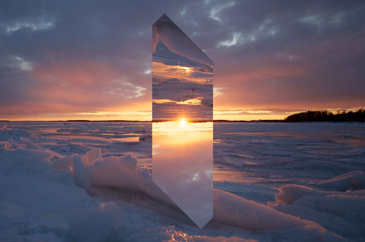
pedro Correa - Artist investigation 1
"My work revolves around the beauty I find in the energy of the big cities. There is, in my opinion, no need to force beauty, it is already out there." - Pedro Correa
|
|
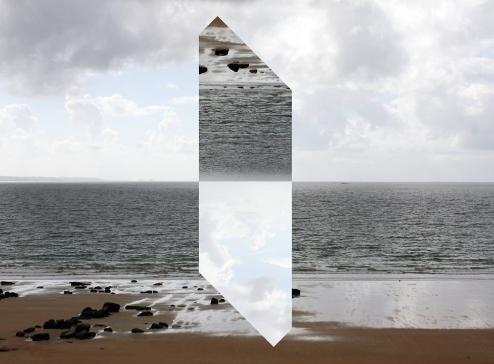
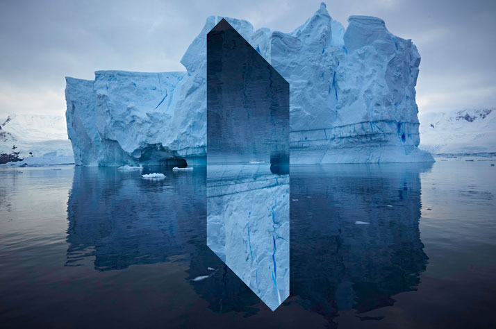
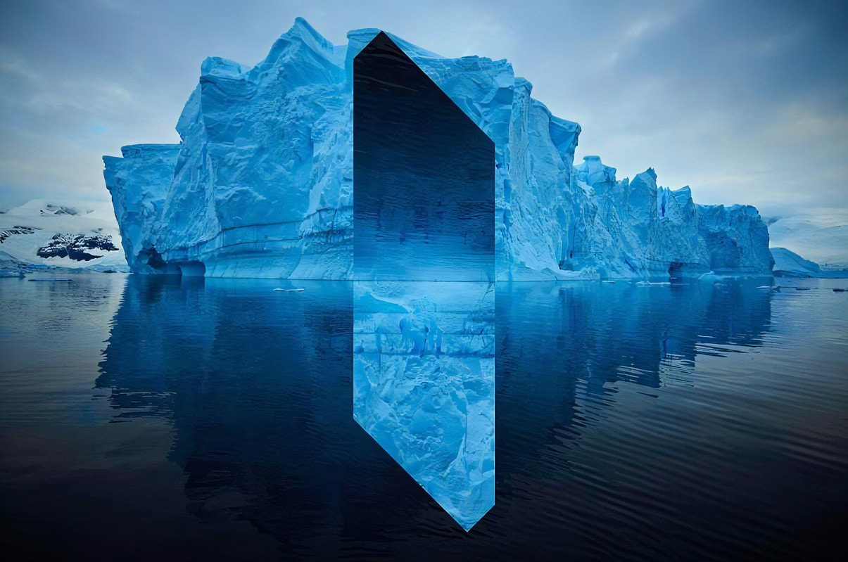
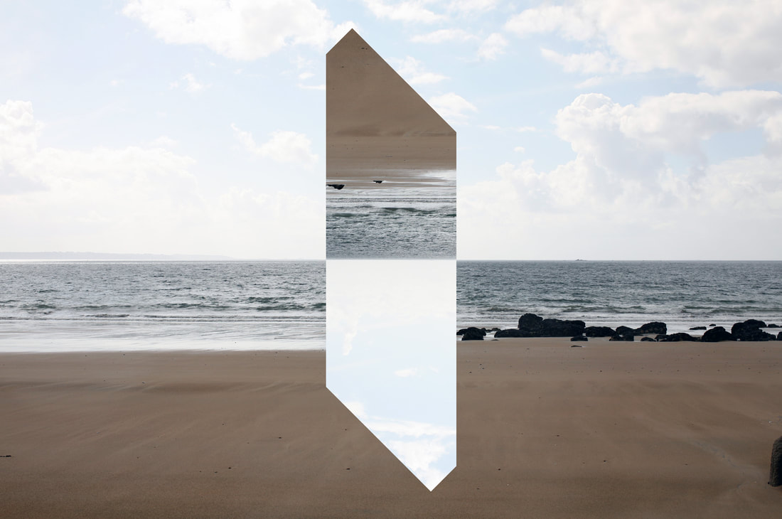
Why this artist?
I decided upon this artist as his work is filled with colours that resonate with me personally, I love warm, bright and low contrast colours as I feel they create a calm image overall and are gentle on the eye. From when I first saw his work, I felt very inspired to begin emulating his style and to look deeper into how he crafts his images. Who are they? Pedro Correa is a fine arts photographer who originally studied in oil painting and comic art at Brussel's Royal Academy of Arts. He then became fascinated with the medium of photography and its capability to 'capture the moment'. Since the start of his career, his work has been displayed in galleries all over the world, notably London, Paris, Washington DC and Hong Kong. Why this quote? I feel this quote expresses his love for the unnatural of giant cities, and the natural of beauty. His work combines these two emotions to form images that feel similar to a breath of fresh air, or a pause in a busy space - a drop in motion. A time to stop and feel the beauty in any space, no matter how it feels on the surface. Website: www.pedrocorreaphoto.com/ |
Semi analysis
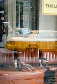
' Wooden Cab' - 2013
|
Subject: This image is one of my personal favourites from Pedro Correa. It's named 'Wooden Cab' and was taken in 2013. The genre relates to my current project, Urban Environments and the condition of living in the modern day and age. Correa states himself that he doesn't create staging for his photographs, he only captures real life, so I personally wouldn't say he uses any props. Elements: The composition of this image creates vast depth as Correa cleverly uses depth to give life to his work. On first inspection, the bright yellow taxi stands out as the central focus of the image, however upon further inspection, I would say the taxi was only an after thought. What stands out to me is the seemingly empty chairs that line the bottom of the image. Another way Correa created a successful image was through perspective - the subject of this image seems fairly mundane, that if you were to walk past you wouldn't notice such delicate detail. The effect of this is that I now feel I should pay more attention to the world around me, especially reflections from another world. Correa also employs a range of visual elements - mainly line - lines of the wood, the leather chairs, the walls, the sign posts... These lines create the feeling of elongation, a long image cut up into little strips of texture. Media: This image has been taken from a short distance - Correa has done this in order to capture both the movement of the outside world and the stillness of the inside. It has been cropped to capture the yellow car but also capture the further outside world - this therefore makes the car the main focal point of the image. The composition of this image is very special as Correa uses layering to his advantage to build a world, rather than just capture it. The viewer is immediately drawn to the foreground, later noticing the mid and background of the chairs and the people. The image was taken using natural light outside, making the image seem very casual and unplanned. This creates an atmosphere of a normal day, no special lighting or layouts needed - just a glimpse into the world outside, the reflection providing this window. To emulate this photo, I would need to spend a lot of time walking around my local area, finding these special reflection that to an ordinary eye would go forgotten.
Intent: I strongly believe that the intent of the artist was to pull factors of life and modern, urban architecture to light and display how things that were maybe designed for another purpose or mistakes can be beautiful and you don't need to edit or change these things for them to create stories - leaving things as they are sometimes create the deepest stories. |
Original Image ^
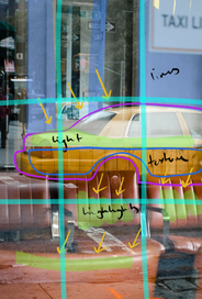
Edited Diagram ^
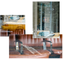
Collage ^
Colour Palette ^
|


I have decided to not complete a shoot based on this artist as I prefer the style and ambience of other artists from this unit of study.
nick guttridge - ARTIST INVESTIGATION 2
"I’m just as interested to work for an up and coming practice as I would for an international advertising agency."
- Nick Guttridge
|
Why this artist?
I decided upon this artist as I really liked his use of pale, cool whites. This photography is also very high key and uses the clouds to carefully paint calm images. Who are they? Nick Guttridge is a UK based photographer of the arts, architecture, design and dance. He is well known in his field and has worked on many commissions from architecture companies and different brands. Why this quote? I really like this quote as I feel it presents the genuine side of Guttridge. Many people get caught up in wanting to be the best and partner with the best, whereas Guttridge genuinely enjoys photography and wants to spend him time with both influential and up-and-coming agencies. He does photography for the art over the money, which I feel has been lost in the current climate of art. Website: http://www.nickguttridge.com/ |
|
SEMI ANALYSIS - comparison to pedro correa
Unknown
^ Original Image
^ Edited Diagram
^ Collage
^ Colour Palette
|
Subject: The photographer of this image is called Nick Guttridge. Both the title and date of creation are unknown. The genre of this image is urban landscape. Similar to Pedro Correa, Guttridge also rarely uses props or specialist equipment to capture him images, allowing for a casual atmosphere to an image.
Elements: The composition of the image has the main focus in the background, where the highlights draw your attention. There is evidence of the rule of thirds being used as the different levels of the building staying in the third lines, similar to Correa. The viewer's eye is led around the image by bring immediately drawn to the brightest part of the image - the windows. Gradually, the viewer is guided by the geometric lines through the image, telling a story of a slow work day. This is different to the story that Correa tells as his image doesn't have many overwhelming highlights, preferring darker tones over lighter. The perspective that Guttridge used is at around eye level, giving the feel of a glance at the building while walking through. Guttridge applies a range of elements in his work, most significantly would be line. This is similar to the previous image by Correa as he uses lines to cleverly frame his images too. Media: This image has been taken from a long distance, allowing for a high level of detail in his image. It has been cropped to cleverly follow the rule of thirds, this is so the main focal point is on emphasising how high key the image is. The image has been taken with natural lighting reflecting on the white walls, reflecting and creating a cool white image. The main light source comes from the windows in the background of the image, creating an almost annoyingly bright image. This further creates an atmosphere of cold, modern buildings and the discomfort associated with them. This is completely different to the atmosphere Correa creates with the warm tones and intriguing view of the urban world. To emulate this image myself, I would need to find a very bright and airy modern building and purposely over-exposing it to replicate Guttridge's style. Intent: I feel the intent pf this image was to present loneliness and the separation between people in the modern era. There is no time to connect with others as life is moving too fast. This image gives off a very slow feeling, very sombre yet clinical - the bright whites and polished lines adding to this feeling of cold 'modernity'. I feel this is completely different to the intent of Pedro Correa, as he wanted to bring warmth to these modern structures, unlike Guttridge who mainly focuses on the buildings itself. |


I have decided to not complete a shoot based on this artist as I prefer the style and ambience of other artists from this unit of study.
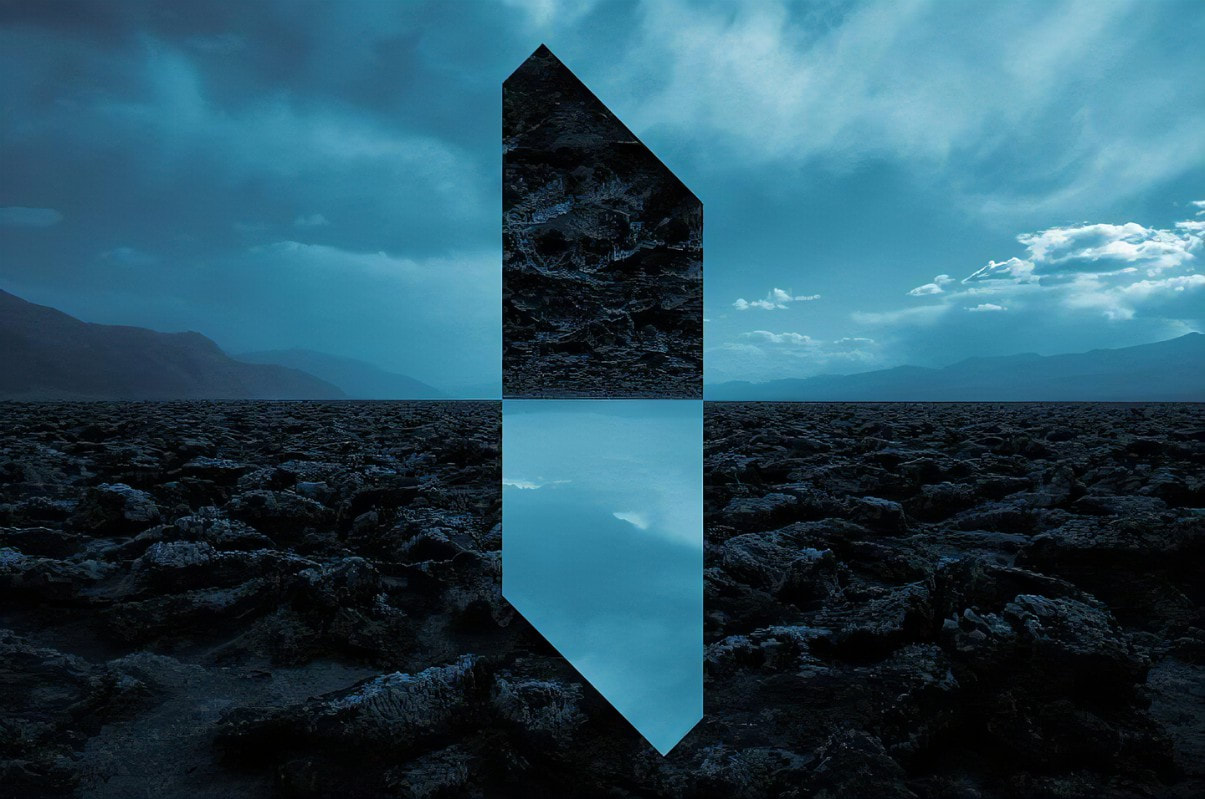
Riccardo magherini - ARTIST INVESTIGATION 3
"I stumbled on (photography). It had been unplanned and unexpected. Now photography is my primary interest, it’s part of my life." - Riccardo Magherini
|
|
Why this artist?
I've decided on Magherini as my 3rd artist of this project as I love their artwork and the way they use blur to create vast images unlike anything I have personally seen before. Who are they? Magherini is a Florence, Italy based artist who began his career as an advertisement and commercial photography, however he moved into the medium of Fine Art photography after a trip to Tokyo, Japan in 2011. Why this quote? I love the quote as it shows how one event in your life can change it dramatically. He only went for a trip, and came back with a new found love of fine art photography. Website: www.riccardomagherini.com/fineart/ |
SEMI ANALYSIS
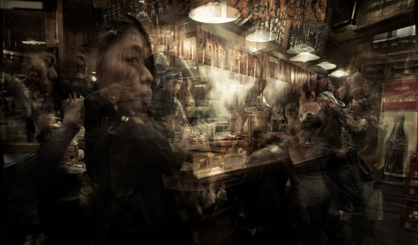
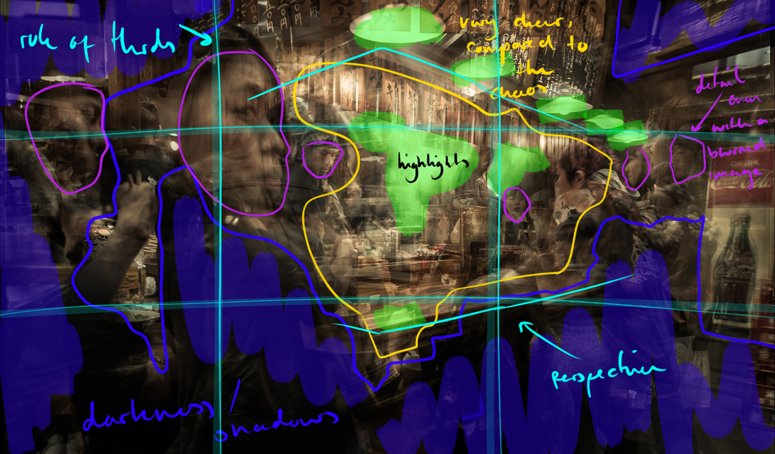
'Izakaya' - 2011
|
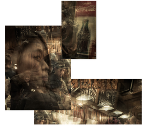
Subject: The photographer of this image is called Riccardo Magherini. The name of the image is Izakaya, and it was taken in 2011. The genre is, of course, urban landscapes. I do not believe any props were used to create this image as it feels very natural, like a snapshot of an evening at a bar.
Elements: The composition of this image presents a foreground, midground and background. The foreground holds the curious, ghostly face of a nameless model. The viewers eye is then led to the right, following through to the midground. We begin to notice more detail of the image life ghosts of people queueing - creating a mysterious atmosphere. The background seems fairly bright caused by steaming food and the overlaid images. I believe this image has followed the rule of thirds due to the framing of the bar - this is also reinforced by the woman on the left, marking a line of the third. Magherini took this photo from eye level, creating the feeling of being in this crowded bar. Magherini also employs a range of techniques in his photography, mainly laying multiple images and creating his signature blurred and uneasy effect. He does this by capturing many images from one place and then layering them in post-production, carefully adjusting the opacity, brightness and colour. Media: This image has been taken at eyelevel to evoke the feeling of being in this image yourself and being surrounded by the emotions. This image has also been cropped to add to the feeling of tightness, suffocation and claustrophobia. Due to the nature of this image, identifying one focal point in quite tricky as the whole image is blurred or distorted. This image probably has a fairly wide focal point to capture the most detail. The viewers eye is led around the image due to the use of line and colour. The eye is first drawn to the ghostly face on the left, and is then shown around the wider scene and the background, seeing the blurred chaos unfolding behind. This image has been taken with the moody and atmospheric lighting of the bar, giving it a familiar nostalgic feeling. Intent: I feel like this image creates an energetic and busy atmosphere due to the laying used to create this image. The texture and depth of this image brings it together and really puts the viewer into this scene, immersing us and making everyone feel different feelings, which could be anxiety, excitement, warmth or dread. This image is important to my project of Urban Landscapes as it puts a twist on traditional, clear photography. Each image is layered, something I would love to use in my own photographs.
|
Original Image ^
Edited Diagram ^
Collage ^
Colour Palette ^
|


shoot plan
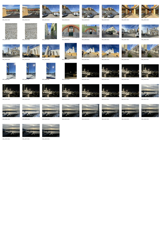
For this shoot, I was inspired by Riccardo Magherini, especially the photograph 'Izakaya'. This shoot will be taken around Portimao in Portugal. I will be taking them at varied times, from day to night. Because of the varying times of day, I will rely on the lighting around me to light my pictures. This will be natural light if in the day, and unnatural, cool light if taken at night. I will adjust my white balance on a few of my layered images to create stronger, brighter whites and darker blacks. My equipment was limited, so I used my handheld iPhone 12. Post shoot, I will rely a lot on physical editing to create my own Riccardo Magherini inspired images as he overlays many images onto one or has a very long exposure. As I couldn't do long exposure work, I opted for overlaying multiple images.
francisco nogueira - ARTIST INVESTIGATION 4
"While I studied, my passion for architecture was obvious, but my enjoyment of the project process was less so. I returned to Lisbon, I rented a studio in Alcântara. Over the years, I began to realise that the most interesting part of photography was the photographing space: be it territory, architecture or interiors." - Francisco Nogueira
|
Why this artist? For my fourth artist, I have decided on Francisco Nogueira. Although simple and calm, his work can create deep meanings through different elements. Who are they? Nogueira is an Architectural Photographer born in 1985, now based in Lisbon. He had always been interested in the arts, leading him to become a full-time Architecture photographer in 2008. Why this quote? This quote presents how Nogueira wasn't enjoying what he was doing, so he acted upon his emotions. I feel this is something very respectable as he had that drive to return to Lisbon and start his own studio, where he finally learnt how to enjoy what he was doing. Website: https://francisconogueira.com/ |
|
SEMI ANALYSIS - comparison to RICCARDO MAGHERINI
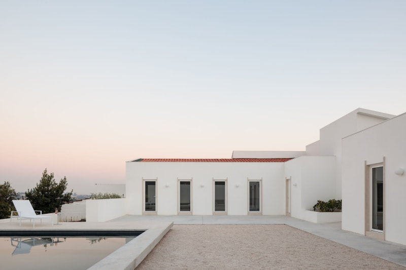
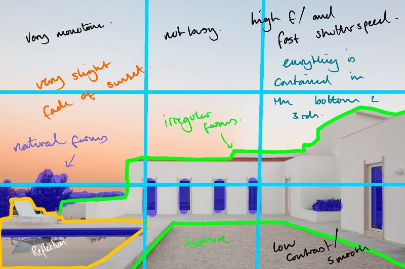
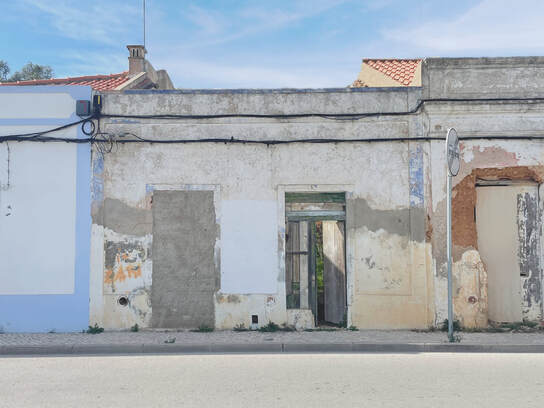
An image from the Costa Brava Housing Project
^ Original Image
^ Edited Diagram
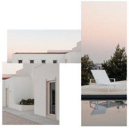
^ Collage
^ Colour Palette
|
Subject: This image is from the Coasta Brava House Project, shot in 2020. by Francisco Nogueira. Th genre of this image is urban landscapes, and the main prom from this image is the house itself, however I cannot see any light sources used apart from the natural light. Riccado Magherini's 'Izakaya' also follows this rule, however the image looks as if it has been edited afterwards to add more atmosphere to the image. Elements: The composition of this image revolves heavily around the middle ground as most of the image features within the middle ground. Only the right-hand side of the house and the pool breach the foreground. Whereas, the trees on the left creep towards the background. I believe the rule of thirds has been used as the subject lies within the bottom 2 thirds of the grid (as shown on the right). 'Izakaya' on the other hand, heavily involves fore, middle and background. Through this use of perspective, the viewer is lead around a relatively flat image, creating a still atmosphere with no life. The perspective is also from eye level, similar to 'Izakaya', placing us as the viewer inside the image. Finally, Nogueira employs a range of techniques including space and line. Through space he creates a large and open image which feels very unrestricted. He also uses line to frame this photograph, creating a modern and straight image. Media: This photograph has been taken from a long distance, once again creating space within this image, unlike 'Izakaya'. The main focal point of this image is the house, as this is also the main subject. The image is framed in a way that feels as is if the house is wrapping around you, due to the pool and walls stretching offscreen. The natural light is used as the hue of the setting sun creates a low-contrast environment which is brilliant for photographing building such as this one. Due to the sun setting, it is unclear to wear the light is coming from. The light creates an atmosphere of serenity yet a modern coldness which is present in most modern buildings. To emulate this image myself, I would need to wait until the perfect time of day to to capture a building similar to this one. Intent: I believe the intent for this image was to evoke a calm and mature atmosphere, unlike 'Izakaya', which evokes an energetic and lively atmosphere due to the crowded and dark look. It does this through the copious amounts of photographical techniques Nogueira uses. His work is very relevant to my project as it presents another side of Urban Landscapes I was yet to discover. I look forwards to completing a shoot based around his work. |


shoot plan
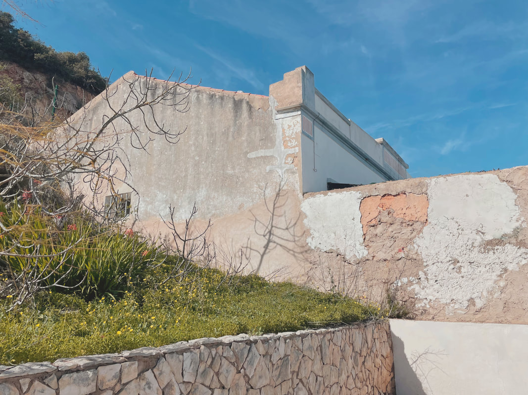
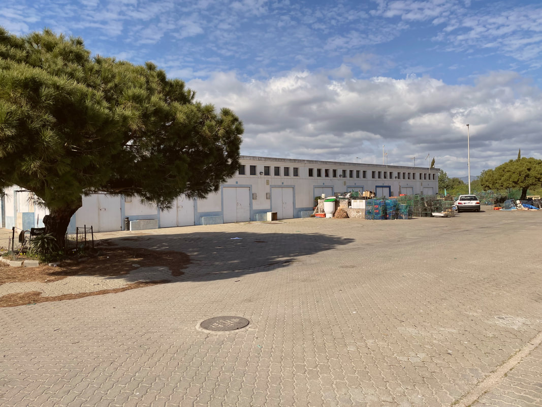
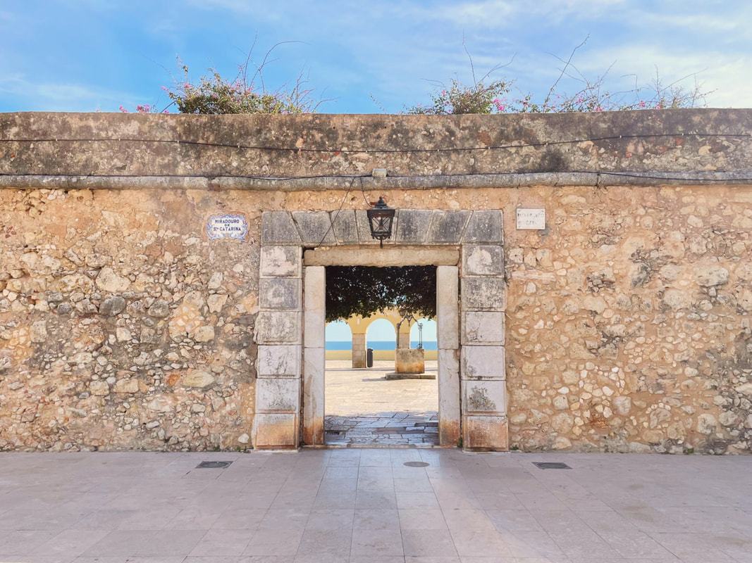
For this shoot, I was inspired by Francisco Nogueira, especially his work from the series shot at the Costa Brava housing project. This shoot will be taken around Portimao in Portugal. I aim to take my images at round noon to sunset to get the best lighting. Nogueira's images are usually very low-contrast and high-key, so I aim to replicate this through lighting and camera settings. I will adjust my brightness to slightly overexpose these images, creating his signature look. My equipment was limited, so I used my handheld iPhone 12. Although it was only an iPhone, there were many features I could use to my advantage. I will rarely use external equipment and props. I may, however, move around some real-world objects to suit my ideas. Post shoot, I will further edit these images to reduce the contrast and increase the brightness and whites. I will also change the colour balance to feel warmer, e.g. increasing reds and saturation levels.
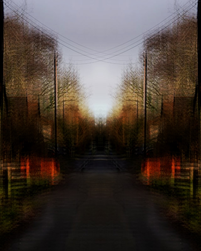
combined MAGHERINI and NOGUEIRA shoot
Magherini Edits
My first set of edits will be using images inspired by Riccardo Magherini.
final magherini edits
best edit
|
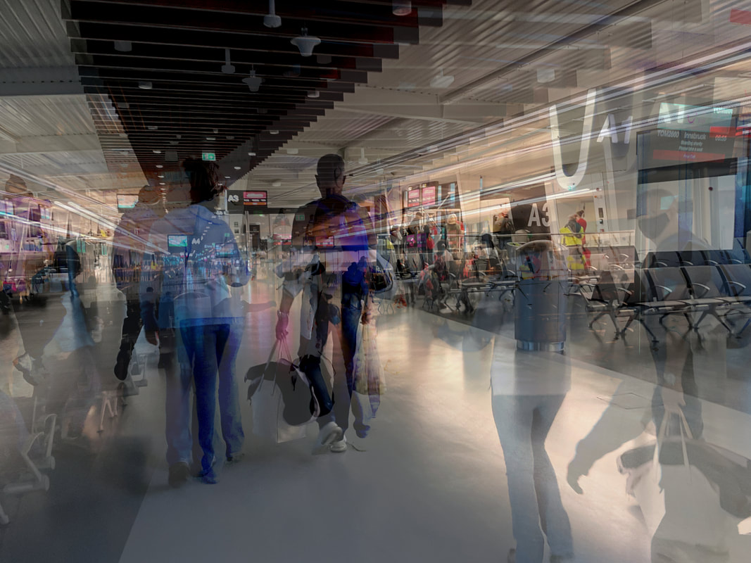
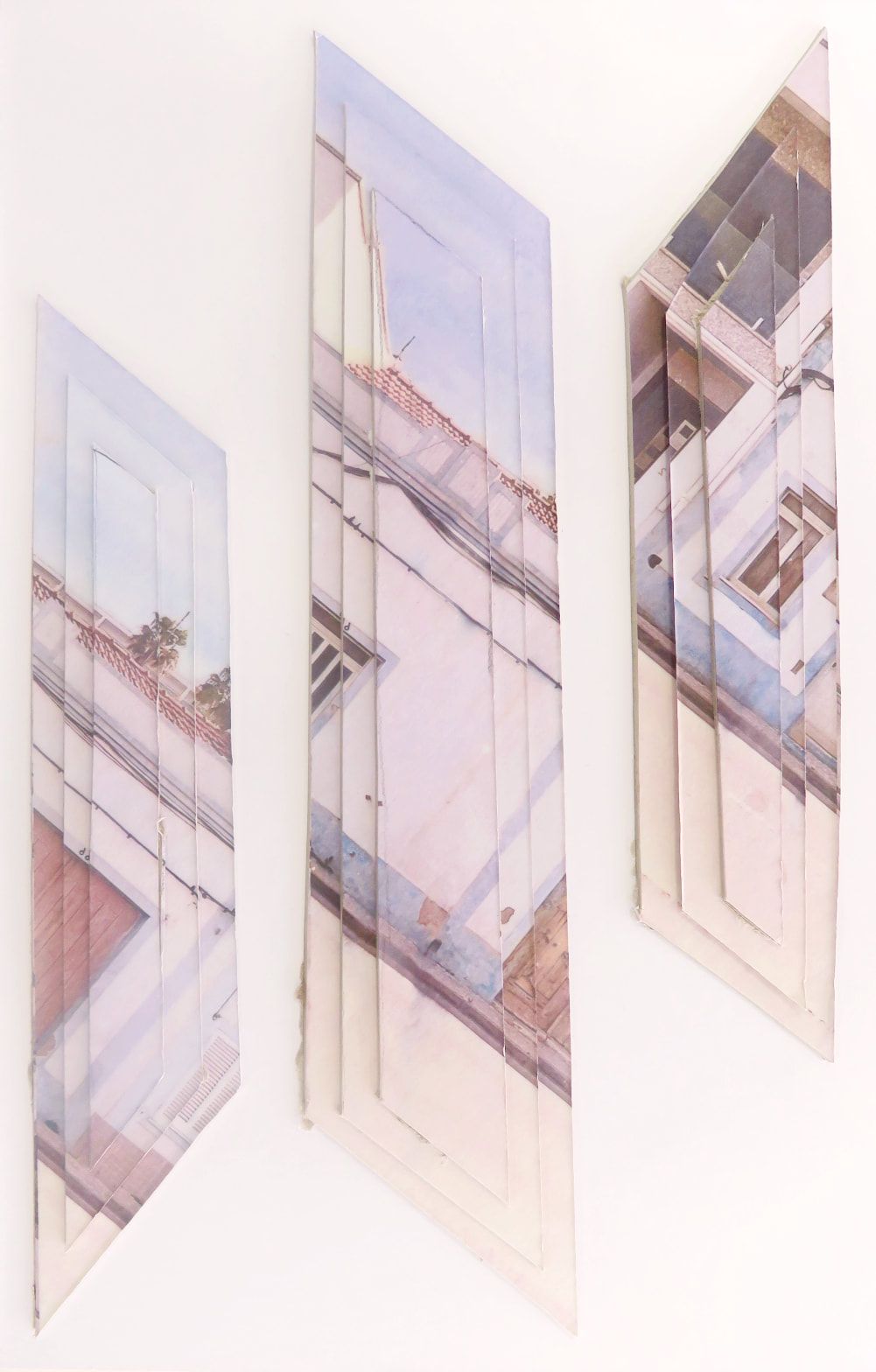
I really love looking at this image because there's a lot going on. I don't have a favourite part or section, as it all works together to create something beautiful. This image was taken and edited by myself. The genre is urban landscapes. I didn’t use props as I was walking around photographing what I saw.
The composition of this image follows the rule of thirds, as the wall curves around and breaks the rule. This wall comes from the bottom left, curving around to the top right. The viewer's eye is led around the image by that very wall as it grounds the image, providing a path through the chaos. The perspective is from around chest height. |
I employed a range of visual elements including form, texture and colour. For the forms, I use the wall and the sky. The sky provides a boundary between the land, containing the chaos below. I also like how the colours came out, vivid and bright. The natural light allowed the image to remain bright through all the layers. Furthermore, the textures also breathe life into the image, allowing the viewer to understand the image for what it was and is now. This image was taken from a moderate distance away from the subjects, cropped to focus on the curving wall. The main focal point is also focused on the horizon ahead. The viewer's eye is led by the curve of the wall and the interruption of the orange and red houses. Beginning at the foreground, venturing down to the middle and then background. The image has been taken with strong, natural light. By using natural sunlight instead of artificial light, the whole image becomes brighter and more alive than any other. The light source shines from above, highlighting all areas of the image and painting the area with warm light.
I wanted to create this image as I also like bright colours mixed with warm ones. I thought this image would be brilliant to use as it contains both of my loved concepts. I also really like how the distortion also adds to the mystery of the image, questioning its origin and warm atmosphere.
I wanted to create this image as I also like bright colours mixed with warm ones. I thought this image would be brilliant to use as it contains both of my loved concepts. I also really like how the distortion also adds to the mystery of the image, questioning its origin and warm atmosphere.
nogueira edits
My first set of edits will be using images inspired by Francisco Nogueira.
FINAL NOGUEIRA EDITS

best edit
|
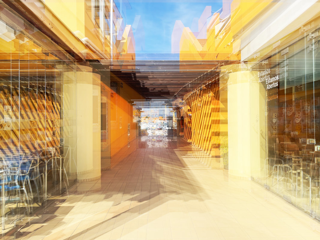
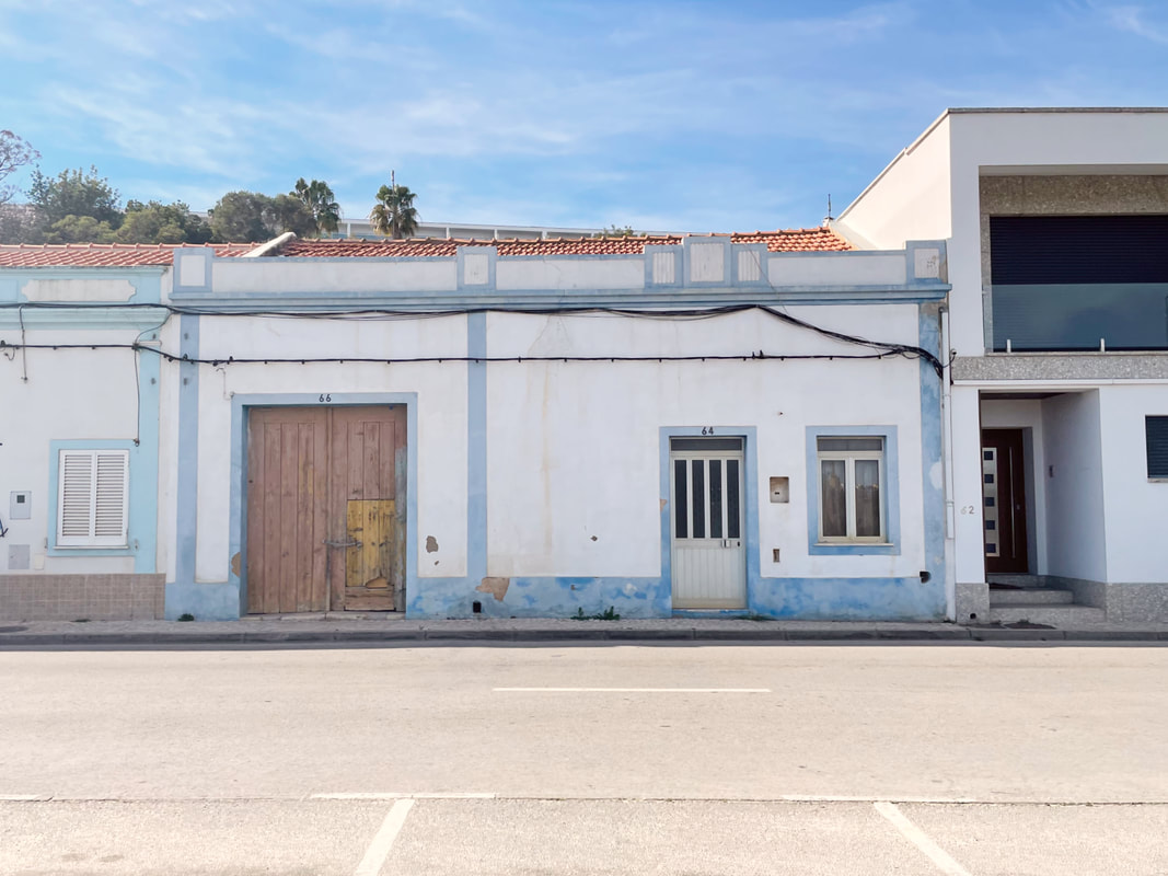
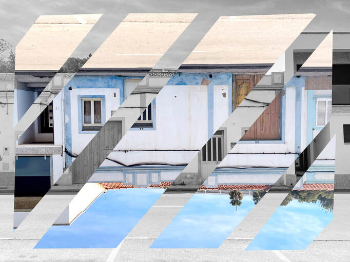
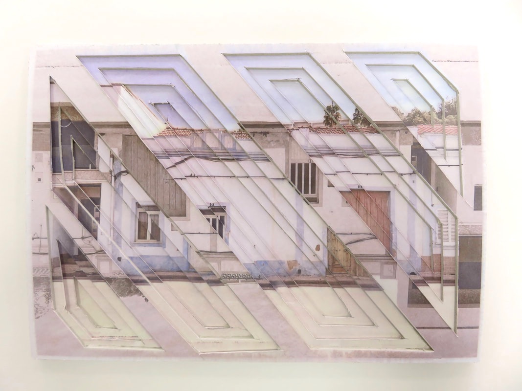
This was one of the first images I created inspired by Francisco Nogueira. Because of this, I believe it's one of my best and fits the genre of urban landscapes. This image was taken and edited by myself. The genre of this image is urban landscapes. I didn’t use props as I was walking around photographing what I saw. Due to the two doors being paired with the lines of the sky and road, the composition of this image follows the rule of thirds, with the main building falling in the central third. The viewer's eye is led around the image by the urban and decayed buildings. The perspective is from around eye level. I employed a range of visual elements including line, texture and space. |
|
The lines of this image, although distorted, create a dynamic and urban image that follows the rule of thirds. I also like how the lines appear differently through the image, with modern, fresh lines on the left and older, cracked and distorted lines on the right. The textures also play a key role in making this image successful. The distorted walls create an abandoned feeling. The cemented door on the left also tells a story about the history of this building. Finally, this image contains a lot of space. Form the sky to the right door slightly ajar, revealing a world hidden. Furthermore, the space adds to the atmosphere, making it feel warm and bright, but almost trapped in some way. This image was taken from far away from the subjects, which was then cropped to follow the rule of thirds. The main focal point is the central building. The viewer's eye is led by the distinctive lines of the buildings. The viewer's eyes are also led around by the shadows and different colours. The image has been taken with strong, natural light. By using natural sunlight instead of artificial light, the whole image becomes brighter and more alive than any other. The light source shines from above, casting shadows on the main building. This allows for the sun to shine through the ajar door, adding to the mystery of the building's past.
I wanted to create this image as when I saw this row of buildings, I knew I needed to document them. Although many were derelict and old, some had been restored. This building especially struck me as very beautiful. I'm thankful that I decided to take the time to photograph this image and forever preserve it.
I wanted to create this image as when I saw this row of buildings, I knew I needed to document them. Although many were derelict and old, some had been restored. This building especially struck me as very beautiful. I'm thankful that I decided to take the time to photograph this image and forever preserve it.
composition design 1
|
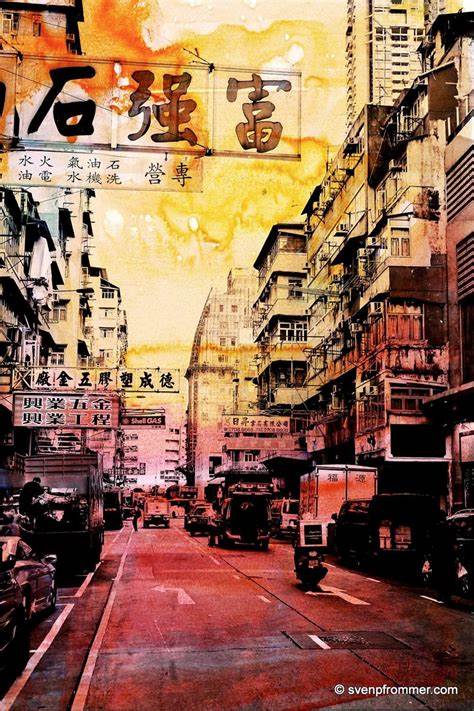
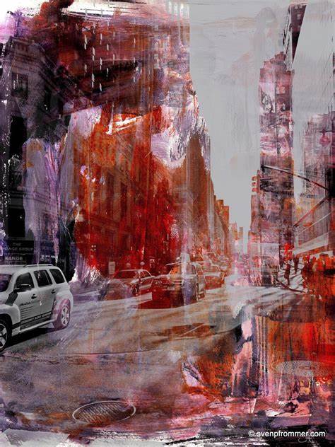
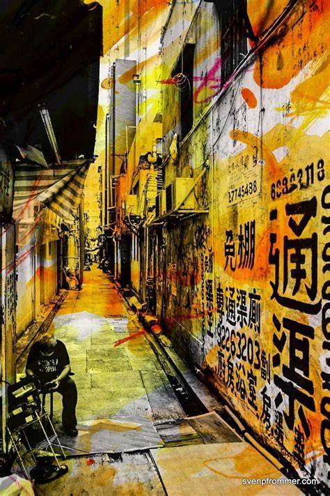
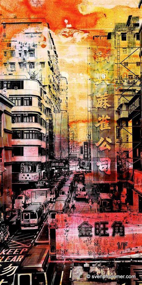
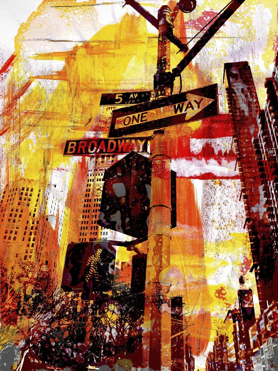
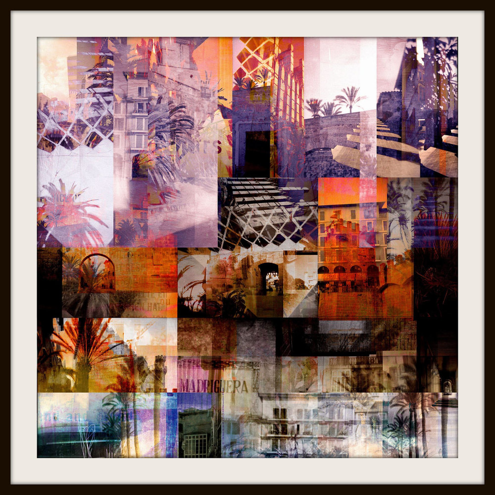
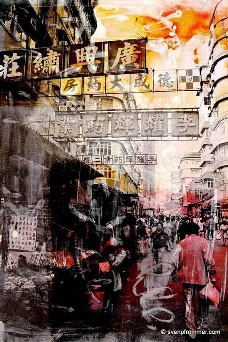
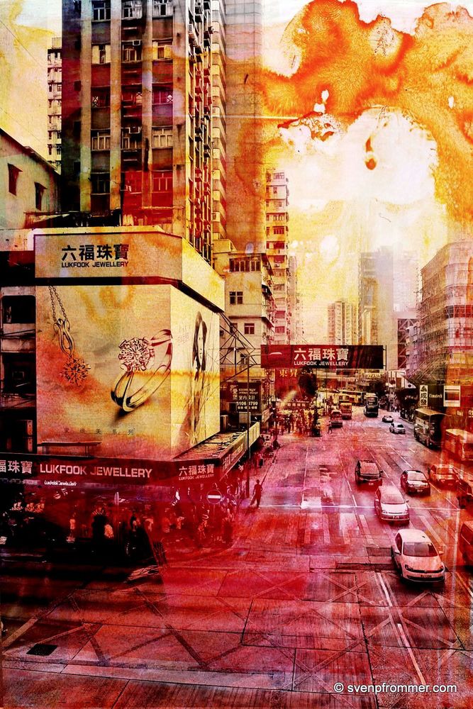
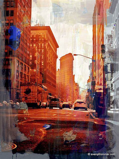
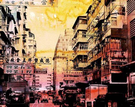
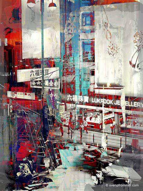
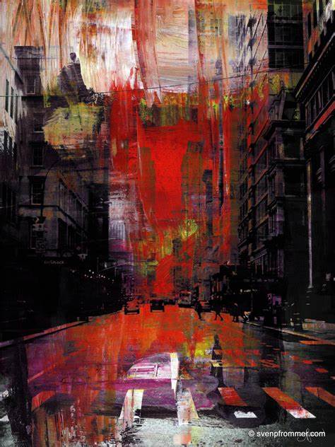
My first composition will be inspired by Sven Pfrommer. Pfommer is a Berlin based artist who's been working in photography for many years. His work has been displayed in many galleries across the world and he works onto a range on materials. I was first inspired by Pfommers artwork as I've always liked painting, so the idea of putting that skill into my photography work was a wonderful idea for myself. His work feels very warm and I love how he uses oranges, yellows and reds to highlight certain areas and ideas in his work. Furthermore, I feel that employing his methods in my work will further enhance my skills as a photographer and artist. Website: https://www.svenpfrommer.com/ |
|
innitial edits
|
|
To create these images, I took edits from my Magherini project and Posturized them. This would allow my edits to come out sharp and clean against the white. I'm very happy with their appearance as they, although defragmented, look very interesting and high contrast. Using these for my physical edits will be very freeing as there is no colour, allowing me to use colours similar to Pfrommer's work.
Editing process
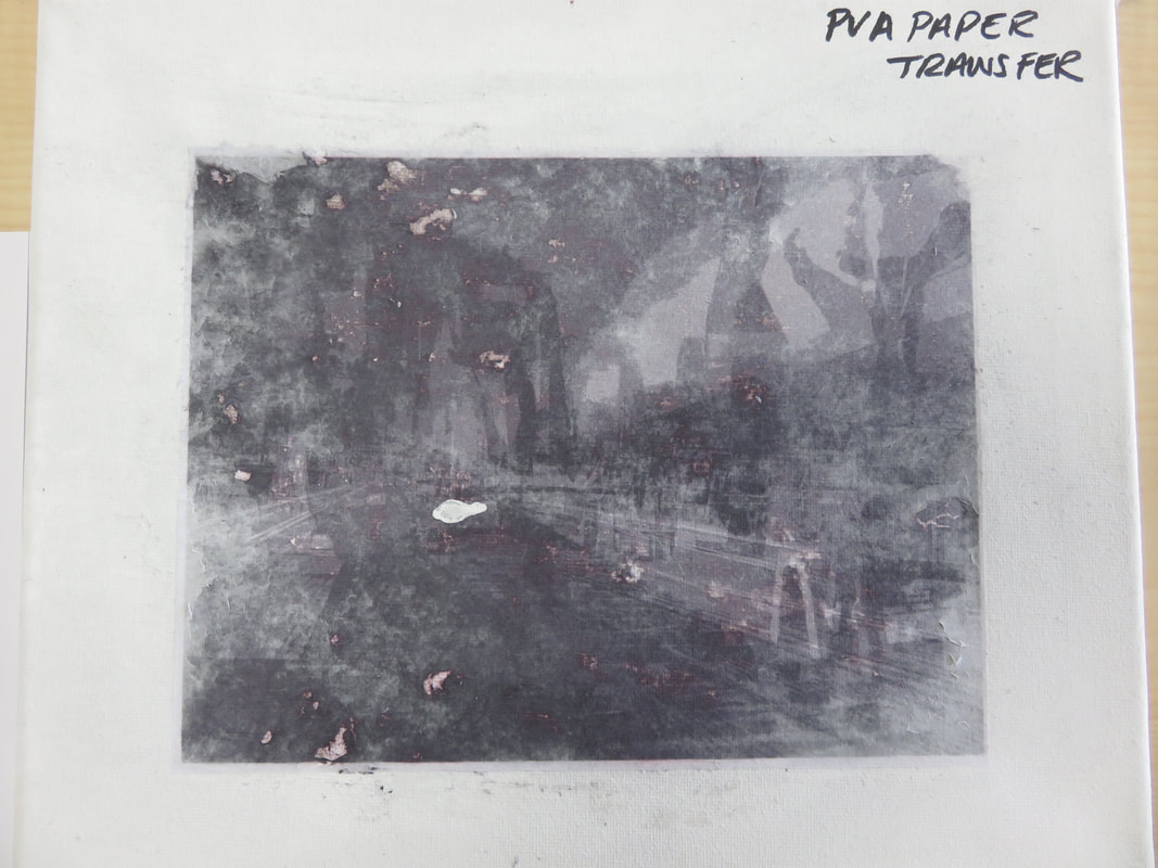
PVA Paper Transfer
|
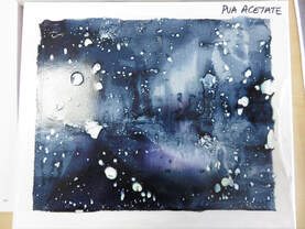
PVA Acetate Transfer
|
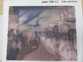
Heat Press Sublimation
|
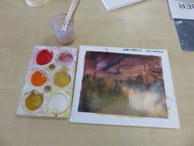
To begin, I needed to figure out how to get my images onto the canvas. I tried 3 different methods, including using PVA to paper transfer onto the canvas, using PVA to acetate transfer and using the heat press to sublimate the image onto the canvas.
Firstly, I attempted the PVA paper transfer, which came out rough to touch and very unclear. This was due to the image being used to transfer being too dark. I decided against this method as it took too long and didn't present the results I was looking for. Next, I tried the PVA acetate transfer and came out very interestingly. Although the method was similar to the previous, the results varied due to the medium. I really liked how the outcome looked burnt and morphed, however, it suffered from the same problem as the previous - the initial image was too dark. Finally, the heat press sublimation was my favourite of them all. It turned out the clearest, brightest and easier out of the three and turned out how I had imagined it. This is the method I used to produce my final images. These examples are shown below.
Firstly, I attempted the PVA paper transfer, which came out rough to touch and very unclear. This was due to the image being used to transfer being too dark. I decided against this method as it took too long and didn't present the results I was looking for. Next, I tried the PVA acetate transfer and came out very interestingly. Although the method was similar to the previous, the results varied due to the medium. I really liked how the outcome looked burnt and morphed, however, it suffered from the same problem as the previous - the initial image was too dark. Finally, the heat press sublimation was my favourite of them all. It turned out the clearest, brightest and easier out of the three and turned out how I had imagined it. This is the method I used to produce my final images. These examples are shown below.
Initial Wash Test
|
Final Piece Masking Tape Peel
|
Final Piece
|
Following the canvas test, I decided to begin experimenting in the style of Pfommer.
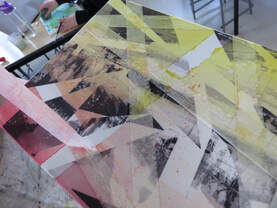
Initially, I tested the colour wash on the initial heat press sublimation. To create the wash, I used acrylic paint diluted with some water. After I was happy with the wash, I printed two separate images on sublimation paper. I then cut these up and collaged them onto a single canvas. This was then sublimated onto the canvas. Afterwards, I placed masking tape across the canvas at angles to create dramatic lines. I then did the wash over the masking tape, waiting for it to dry, and peeled off the masking tape. To enhance the wash bleeding through the masking tape, I used fine liner to draw around the colours, enhancing my artwork further.
Initially, I tested the colour wash on the initial heat press sublimation. To create the wash, I used acrylic paint diluted with some water. After I was happy with the wash, I printed two separate images on sublimation paper. I then cut these up and collaged them onto a single canvas. This was then sublimated onto the canvas. Afterwards, I placed masking tape across the canvas at angles to create dramatic lines. I then did the wash over the masking tape, waiting for it to dry, and peeled off the masking tape. To enhance the wash bleeding through the masking tape, I used fine liner to draw around the colours, enhancing my artwork further.
final composition design
Multi Exposure |
Overlays |
Colour and Mono |
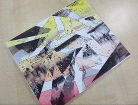
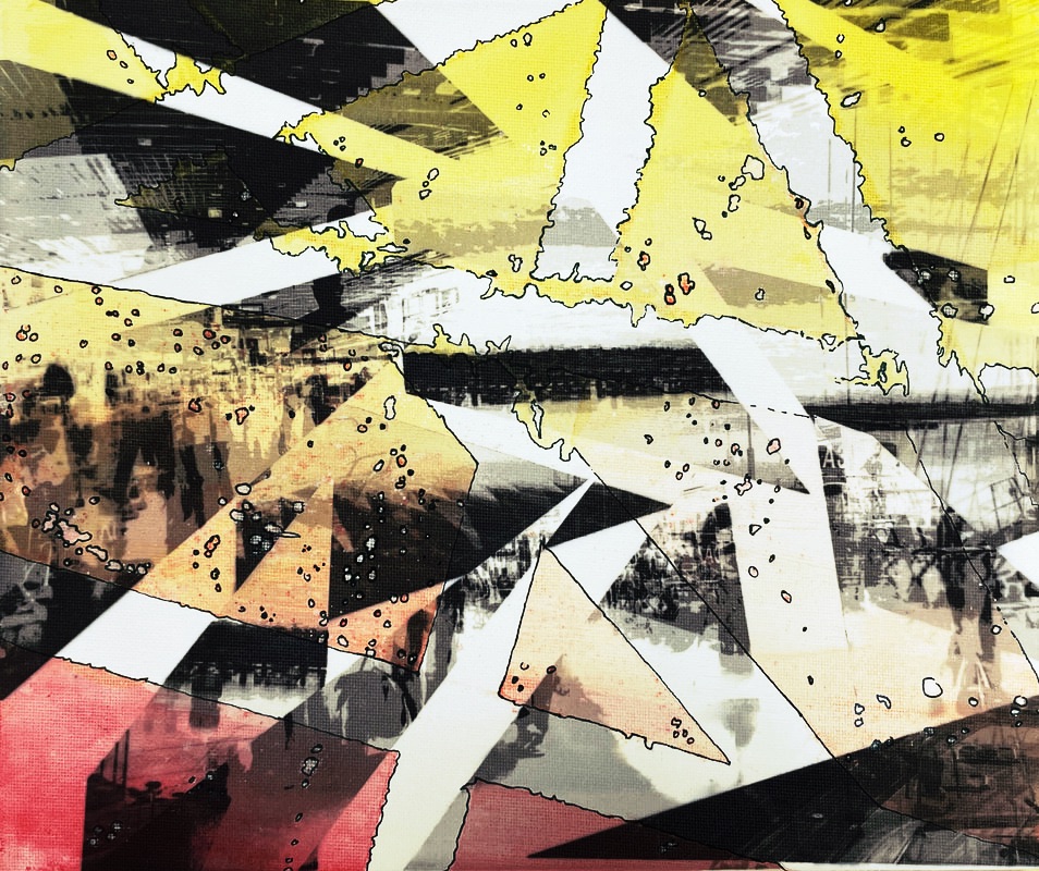
After completing my first compositon, I'm really happy with how my final piece turned out. I also like how my digital edits on the side turned out as they add a different twists to the original image. First off, the fragmented sublimation of the Magherini edits creates as air of mystery and confusion in the image. The adition of the red, orange and yellow also highlights different areas and layers of the final image. I also really like the outline of the colour and distortions as it doesnt hide from the imperfect. If I could change anything about this composition, I would have created more edits to go along side this one to compliment it.
composition design 2
|
My second composition will be inspired by Reynald Drouhin. He began his artistic career while at Paris 1 University. He then went to the fine arts school of Paris where he studied serigraphy and computer science. In his own words, "My works often result from codified data or an established protocol – sometimes generative – and reveal a profusion of random and fragmentary representations." I was inspired by his work due to its seeming similar look initially, however the result can be astoundingly different each time. When creating my own pieces, I aim to emulate his style in my own unique way. Website: https://www.reynalddrouhin.net/ |


editing process
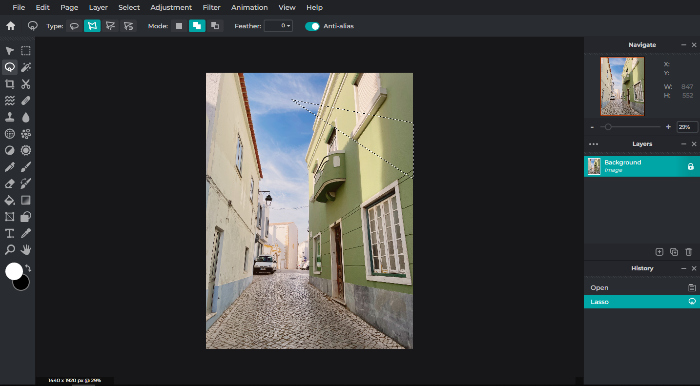
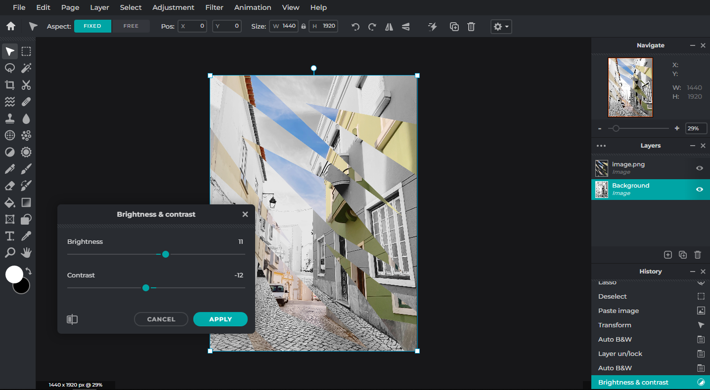
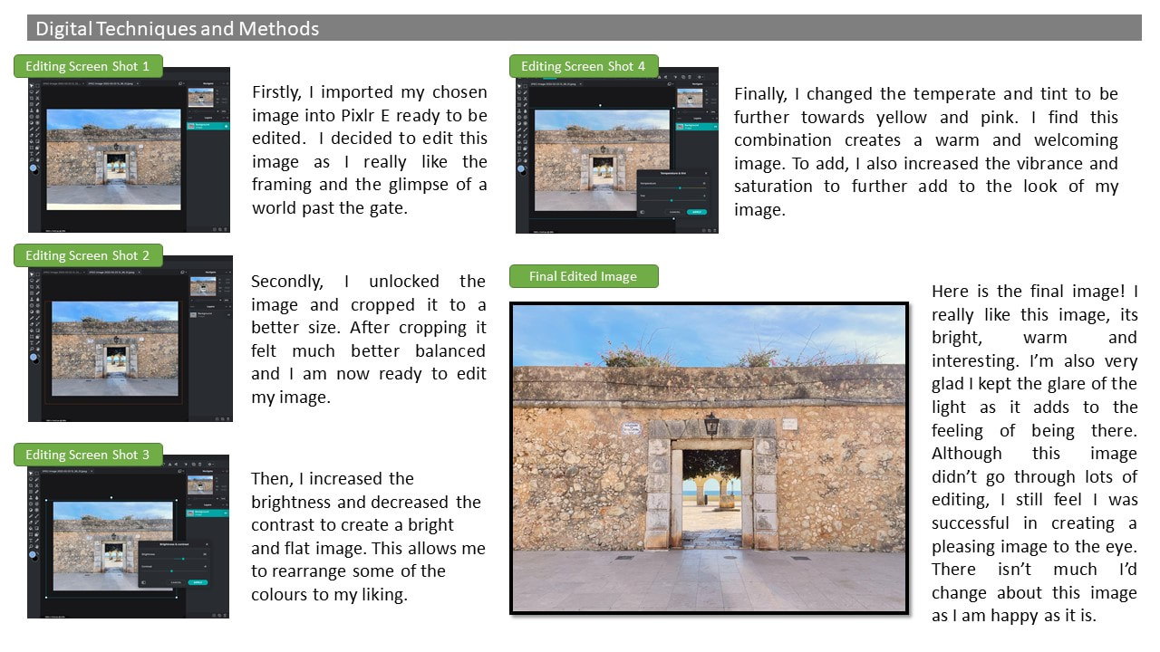
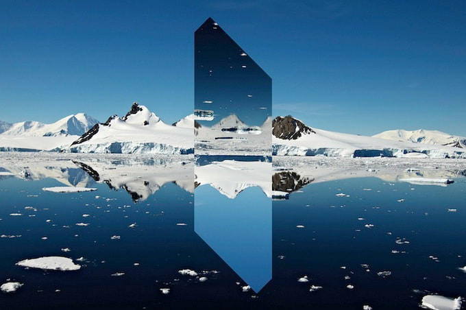
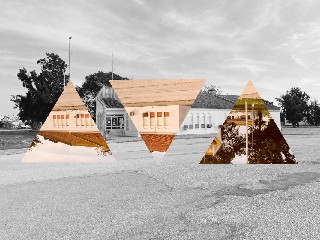
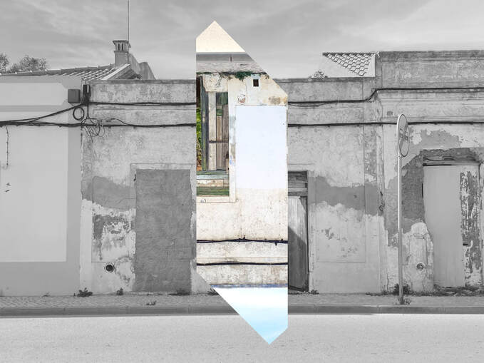
Firstly, I imported my image onto Pixlr E. I made a few subtle edits to ensure my image looked how I wanted. Next, I used the lasso tool in polygon to cut out different angular shapes. I then copied and pasted this onto a new layer. Afterwards, I moved the shards around the image to where I liked them. I also used auto B&W on the background image. Finally, I played with the brightness and contrast until the colour stood out against the black and white background.
final EDITS
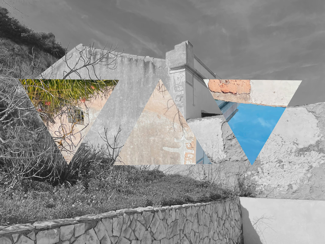
|
|
I like how these images came out as the contrast of the black and white with the upside-down, coloured triangles creates a very dynamic and interesting image. I think in was successful in creating warm tones in the triangles compared to the cold and lifeless tones of the lack and white. I also like how the flipped triangles create distortion within the images. This distortion allows the viewer to see into a different world.
|
|
These are my two favourite edits from the series as one has lots happening, whereas the other has a little happening and closely follows the artists style. The range of edits also presents how art doesn't need to follow the mould - it can branch out and become something new. I will be using the right image as the base of my final composition as it has artistic freedom.
further physical editing
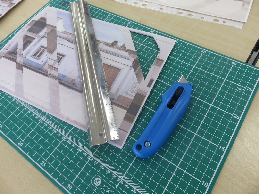
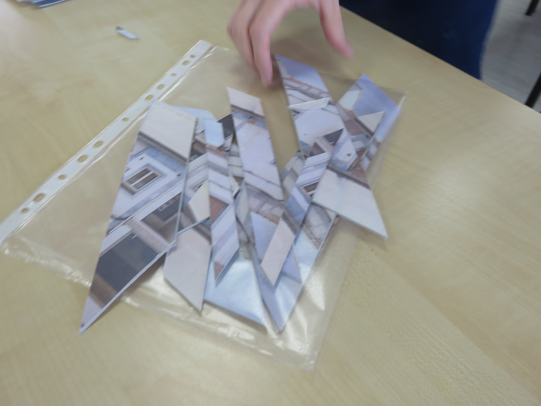
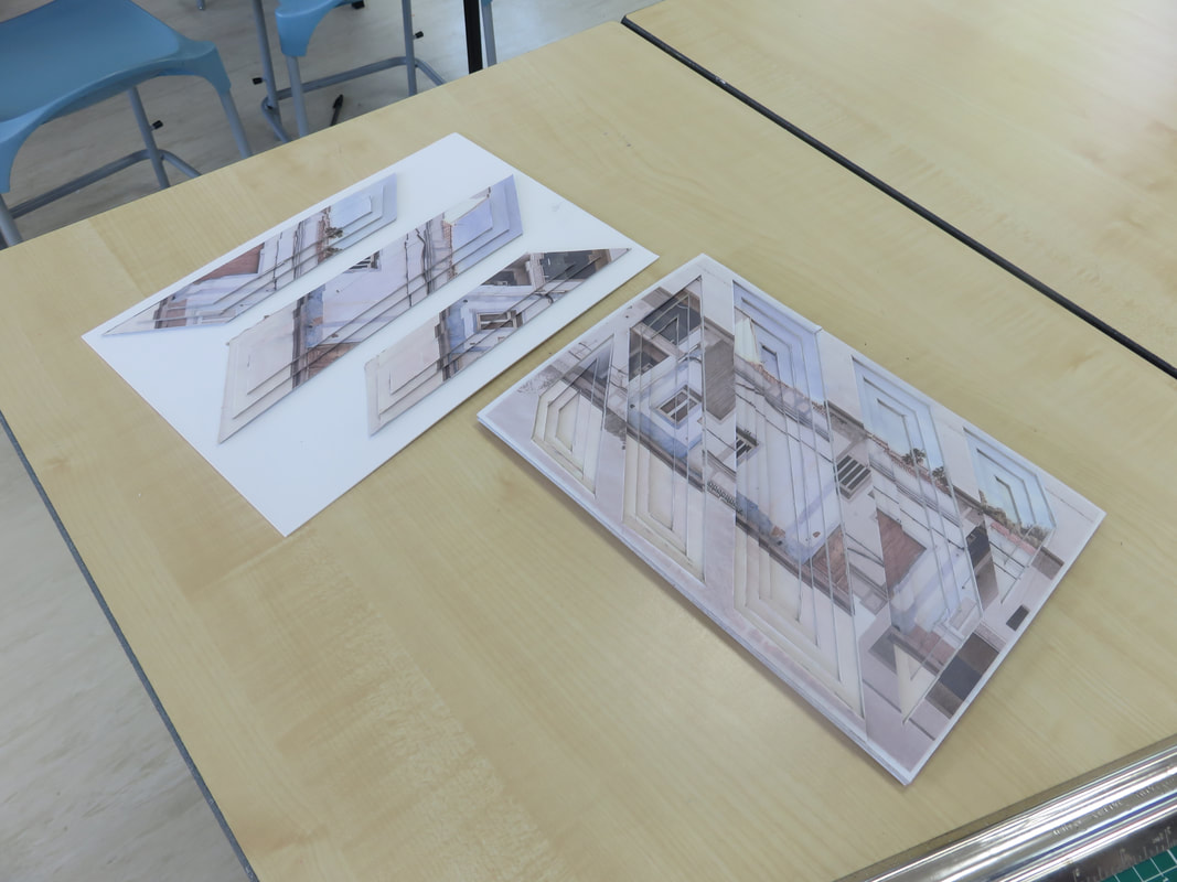
Firstly, I sublimated the same image 5 times onto mount board. This was going to make up my main physical sculpture. I began cutting out sections of the mount board, gradually getting smaller and smaller. This creates a descending effect, looking very unique in real life. After I had cut all my sections out, I began gluing the mount board down. With the extra cut outs, I created a further physical edit where the layers moved upwards, reaching out of the frame.
FINAL COMPOSITION DESIGN
|
|
Looking back at this project, I am very happy with how both of my compositions turned out. I'm glad I was able to use the cut outs from my initial idea and use them to create something new and separate to its source. I still love the look of these card sculptures but if I could redo them, I would have taken more time to properly cut them out with care. The rustic finish aids the overall atmosphere of the piece.
evaluATION
After completing my Urban Environments project, I have learnt many useful skills and developed my understanding by creating artwork influenced by others, adding my own style to many pieces. After working on this portfolio for 2 years, I can look back with satisfaction that I have created something I can be proud of.
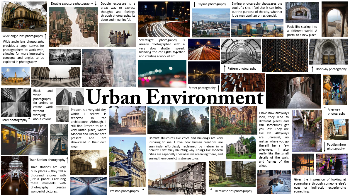
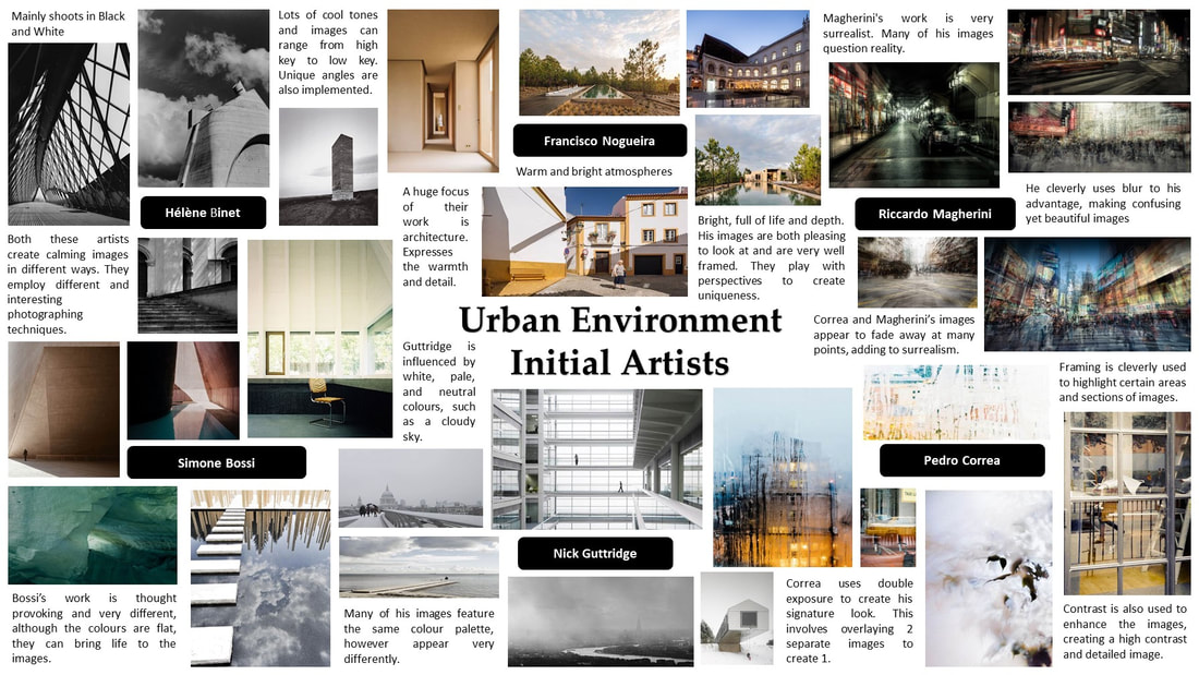
To begin my Urban Landscapes project, I created initial research pages where I collated a group of sub-genres contained in Urban Landscape. I created a collage of inspirational images alongside annotations which explained my thoughts on each style. Afterwards, I created a further collage which highlighted a group of artists I had taken an interest in. These artists were Helene Binet, Francisco Nogueira, Riccardo Magherini, Pedro Correa, Nick Guttridge and Simone Bossi. I imported several images of their work and discussed the effects of their work on this collage. As the collection of photographs was from a wide and diverse genre, it gave me greater insight into Urban Landscapes. I would go on to use some of these artists later in my work. Overall, I am incredibly pleased with how my collages look. They have a perfect mix of business and minimalism, creating a balanced introduction to a wonderful genre.
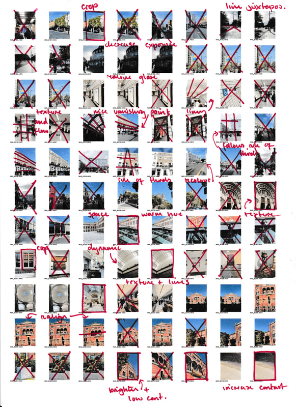
Continuing, I then had the opportunity to explore London and the plethora of Urban Landscapes and creative artworks there. As I previously explained, I was fortunate enough to visit both the V&A and Tate Modern. While travelling around London, I was able to practice taking photos with Urban Landscapes in mind. This process further aided my understanding of composition and the question of ‘What makes an Urban Landscape photograph?.’ When taking these images, my focus was on composition, space, and line. For most of my images, I stuck to the trust rule of thirds and harnessed the idea of a vanishing point to create detailed, interesting images. Looking back, I am glad about how these images turned out. They also greatly helped in my further understanding of Urban Landscapes. HOWEVER, if I could do anything different, I would have stayed in London longer to explore further, finding different and unique areas. Even with my limited time, I was still able to take images that I am proud of.
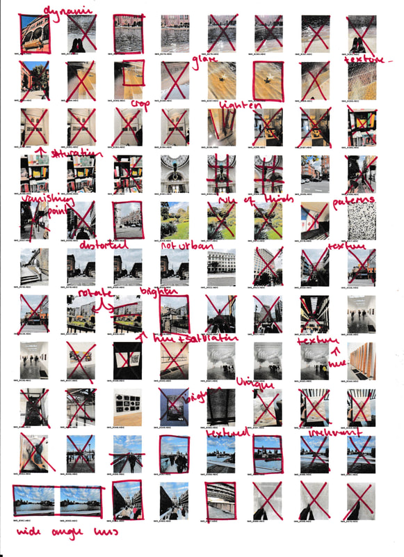
Afterwards, I built upon my prior research by creating a photo safari for the genre. I completed 4 different shoots in different areas inspired by the contrasting methods presented in the photo safari. My first 3 shoots were done in school, followed by a home shoot completed around my home estate. Overall, I took around 300 images. Having this broad range of images to use allowed me to highlight the best and the worst, exploring what I can do as a photographer. The main techniques I explored during this time would be light, depth and movement. Combining these ideas granted me an initial idea of what I wanted to capture in these shoots. After I had performed these shoots, I edited them using symmetry, colour, and rotation. By using rotation and symmetry, I was able to create unique and unusual outcomes which brought Urban and Unnatural together. I then decided upon my favourite edit and analysed it. I am pleased with the overall outcome of this photo safari as although I had not done one for a while, I was able to eclipse the previous attempts. Due to my experience, I was able to create one of my favourite images from my entire portfolio. Nonetheless, there were still numerous occasions where I could improve. For example, I could have edited more images, or taken more to push myself out of my comfort zone. Improvements aside, I am still pleased with the outcome of my photo safari.
The first artist I researched was Pedro Correa. I was originally inspired by his work due to his unique use of double exposure and overlays. I was also captured by his colours and eye for detail. Through studying this artist, I explored the concepts of tone, movement, and balance. Correa used tone to emphasise areas of his work, usually bringing a brighter and airy atmosphere to his images. Similarly, he uses movement as a big part of his work. From falling water droplets to people walking. This focus on movements brings a rare life to his images which people notice. This life is what causes people to become interested in artwork. While researching Correa, I noticed that many images possess a foreground and background image that separates two scenes. This technique is something that can be instantly recognised as Correa’s. If I were to create emulations of Correa’s work, I would have taken exceptional care to find a location fitting his style. I also would have experimented with double exposure in real life, rather than digitally recreating it. His work has benefited my understanding of Urban Landscapes as his personal style is very imaginative and ethereal in ways. It can show that even ‘urban’ areas can be turned into a beautiful work of art.
Following Correa, I researched an artist by the name of Nick Guttridge. His work, although Urban Landscape, contrasted Correa’s strong use of colour, flow, and movement. Guttridge relied on strong lines, form, and monochrome shades to create cold, almost lifeless images that intrigued the viewer. I picked out these certain techniques as they perfectly presented how Guttridge expressed his images. If I were to create my own emulations of his work, I would also need to employ the use of monochrome colours and lines. I found his use of lines to be fascinating – each line seemed as if it was perfectly chosen to exist in that one position. Especially in more obscure works, his use of lines brings a tangible aspect to his artwork. If I have had more time, I would have loved to try my hand at Guttridge’s style. Unfortunately, I was only able to cover 2 artists who will follow now.
To begin my Urban Landscapes project, I created initial research pages where I collated a group of sub-genres contained in Urban Landscape. I created a collage of inspirational images alongside annotations which explained my thoughts on each style. Afterwards, I created a further collage which highlighted a group of artists I had taken an interest in. These artists were Helene Binet, Francisco Nogueira, Riccardo Magherini, Pedro Correa, Nick Guttridge and Simone Bossi. I imported several images of their work and discussed the effects of their work on this collage. As the collection of photographs was from a wide and diverse genre, it gave me greater insight into Urban Landscapes. I would go on to use some of these artists later in my work. Overall, I am incredibly pleased with how my collages look. They have a perfect mix of business and minimalism, creating a balanced introduction to a wonderful genre.
Continuing, I then had the opportunity to explore London and the plethora of Urban Landscapes and creative artworks there. As I previously explained, I was fortunate enough to visit both the V&A and Tate Modern. While travelling around London, I was able to practice taking photos with Urban Landscapes in mind. This process further aided my understanding of composition and the question of ‘What makes an Urban Landscape photograph?.’ When taking these images, my focus was on composition, space, and line. For most of my images, I stuck to the trust rule of thirds and harnessed the idea of a vanishing point to create detailed, interesting images. Looking back, I am glad about how these images turned out. They also greatly helped in my further understanding of Urban Landscapes. HOWEVER, if I could do anything different, I would have stayed in London longer to explore further, finding different and unique areas. Even with my limited time, I was still able to take images that I am proud of.
Afterwards, I built upon my prior research by creating a photo safari for the genre. I completed 4 different shoots in different areas inspired by the contrasting methods presented in the photo safari. My first 3 shoots were done in school, followed by a home shoot completed around my home estate. Overall, I took around 300 images. Having this broad range of images to use allowed me to highlight the best and the worst, exploring what I can do as a photographer. The main techniques I explored during this time would be light, depth and movement. Combining these ideas granted me an initial idea of what I wanted to capture in these shoots. After I had performed these shoots, I edited them using symmetry, colour, and rotation. By using rotation and symmetry, I was able to create unique and unusual outcomes which brought Urban and Unnatural together. I then decided upon my favourite edit and analysed it. I am pleased with the overall outcome of this photo safari as although I had not done one for a while, I was able to eclipse the previous attempts. Due to my experience, I was able to create one of my favourite images from my entire portfolio. Nonetheless, there were still numerous occasions where I could improve. For example, I could have edited more images, or taken more to push myself out of my comfort zone. Improvements aside, I am still pleased with the outcome of my photo safari.
The first artist I researched was Pedro Correa. I was originally inspired by his work due to his unique use of double exposure and overlays. I was also captured by his colours and eye for detail. Through studying this artist, I explored the concepts of tone, movement, and balance. Correa used tone to emphasise areas of his work, usually bringing a brighter and airy atmosphere to his images. Similarly, he uses movement as a big part of his work. From falling water droplets to people walking. This focus on movements brings a rare life to his images which people notice. This life is what causes people to become interested in artwork. While researching Correa, I noticed that many images possess a foreground and background image that separates two scenes. This technique is something that can be instantly recognised as Correa’s. If I were to create emulations of Correa’s work, I would have taken exceptional care to find a location fitting his style. I also would have experimented with double exposure in real life, rather than digitally recreating it. His work has benefited my understanding of Urban Landscapes as his personal style is very imaginative and ethereal in ways. It can show that even ‘urban’ areas can be turned into a beautiful work of art.
Following Correa, I researched an artist by the name of Nick Guttridge. His work, although Urban Landscape, contrasted Correa’s strong use of colour, flow, and movement. Guttridge relied on strong lines, form, and monochrome shades to create cold, almost lifeless images that intrigued the viewer. I picked out these certain techniques as they perfectly presented how Guttridge expressed his images. If I were to create my own emulations of his work, I would also need to employ the use of monochrome colours and lines. I found his use of lines to be fascinating – each line seemed as if it was perfectly chosen to exist in that one position. Especially in more obscure works, his use of lines brings a tangible aspect to his artwork. If I have had more time, I would have loved to try my hand at Guttridge’s style. Unfortunately, I was only able to cover 2 artists who will follow now.
My third artist is Riccardo Magherini. Out of all the artists I studied, Magherini is my favourite for many reasons. At first view, his work can seem chaotic, distorted, and unclear. All these points are true however when you look closer, details begin to form and the true beauty of the image shines through. Magherini’s work harnesses the principles of contrast, movement, and space. By taking multiple images from different vantage points, he creates a sharp contrast image that although distorted, is highly detailed and intricate. He also uses this to create movement. The askew multi-exposure builds upon this movement and enhances the feeling of pressure and absence of space. Furthermore, Magherini also employs space in his work, in excess or lacking. His clever use of space connects the viewer as many people have anxiety about these types of situations. Magherini takes these moments and turns them into something that can be appreciated by many people. Magherini was one of the 2 artists with who I created emulations. Through creating these emulations, I explored how he creates his iconic multi-exposure photographs. To create my own, I took multiple images of the same scene and then digitally overlayed them onto a background image. I then changed the opacity and blending style to imitate Magherini. After completing this shoot, I reflected on how Magherini’s work developed my understanding of Urban Landscapes further. I particularly enjoyed his style as it allowed me to make errors without worrying about them being highlighted and scrutinised.
My final artist evaluation was of an artist named Francisco Nogueira. I chose him as my final artist as his photographs were simplistic yet beautiful in both the composition and in the clever use of colour. Each of his images have a warm, calming atmosphere that resonates with many people, me being one of them. By studying Nogueira, I experimented with texture, space, and contrast. Firstly, his use of texture brings soul to the image. The natural lighting extenuates the textures, ridging the barrier between life and photograph. Having something such as texture in an image brings a particular air to his photographs. Having clear and detailed texture also ties in with his use of contrast. Nogueira's use of contrast is a perfect balance, not too much and not too little. Although many of his images could be considered low contrast, it fits well with his overall atmosphere and scenery. Having too much contrast will offend the eyes, yet too little would make it dull and uninteresting. Having visual guidance for the right amount of contrast helped me advance my knowledge of Urban Landscapes. After analysing Nogueira, I performed another emulation shoot of his work. Fortunate enough, I was in Portugal at the time; this is where Nogueira is from and where takes most of his images. This shoot also encouraged my learning of how to deal with unusual and unfamiliar environments. I am pleased with how my photos looked and what I was able to do with them. Overall, studying Nogueira's work enormously aided my understanding of Urban Landscapes as he embodies what Urban Landscapes mean. I am grateful I was able to complete a shoot based on his work. After completing both shoots, I edited the images and then analysed my favourite of the edits.
My first composition was further inspired by Sven Pfommer. For this composition, I used my previous edits inspired by Magherini as they were similar enough to Sven's work, however they introduced a new aspect to something pre-existing. Constructing compositions like Pfommer was much more hands-on than my previous work, as he employs physical editing over digital. He uses elements such as tone, colour and contrast, elements which Magherini also detailed in his work. Pfommer efficiently uses red and yellow washes of paint over a monochrome photograph, through this method he creates dynamic and colourful pieces of art. When creating my composition, I explored the technical process of sublimation and painting. I was excited to paint as it had been a long time since I had last done so, however, it was my first time sublimating onto canvas. I would go on later to use sublimation again in my second composition, proving it a useful skill to know. After creating my sublimated canvas, I painted over it in the style of Pfommer. After that, I took photos of my final composition and imported them into my editing software, creating further edits with my final image. Although I was coming close to finishing my Urban Landscapes project, I still picked up many skills that I can take into my further education. Some of these skills, as stated before, included sublimation, advanced editing techniques and creating framing. I am also glad that I had whole creative control over this composition; being allowed to create what I want to give me the courage to pursue the art I want to create helped me when entering my second composition.
Finally, I completed my second composition. This composition took inspiration from Reynald Drouhin. Originally, I was inspired by his repetitive edits of vastly different landscape images. Although this blueprint is continued throughout his work, I used this as a stepping-stone to creating similar images. Through studying his work, I explored the themes of unity, balance and form. His use of the same copy-and-paste edit style conveys unity even if the subject matter is largely different. This use of unity also provides a common link between otherwise general images; the similarities make them noticeable as Drouhin’s work, making them unique. Drouhin also adopts balance and form through his edits, through the colour and distinct shape used. His images often have high contrasting colours to make them pop, allowing the images to have a brighter and more interesting image. To create my emulations, I used my Nogueira edits and imported them into my editing software, Pixlr. I then cut out, rotated and duplicated many of my cut-outs to create my own Drouhin inspired images. Afterwards, I sublimated one of my favourite images 5 times onto the mount board. I then used a Stanley knife and cut out slowly decreasing sizes out of the boards to create a sculpture out of my image. I created 2 sculptures through this process. This final composition helped me understand Urban Landscapes as it helped me understand how I can present my ideas through sculptures. Having the ability to present my creations in a 3D form gives a strong sense of accomplishment as having something you can touch and have worked on is far more rewarding than editing on a screen.
I believe my most successful outcome from this unit was my first composition. I love how the soft colours and hard lines complement one another. The composition of the image from the arrangement of the sublimated fragments, to the carefully outlined colour wash. I credit this to my acute research and planning of how I wanted my final piece to look. I also like how I was able to use a canvas rather than a normal mount board. Using this canvas allowed me to successfully complete my physical edits. The contrast of the black, white and red hues also allowed my composition to be successful.
However, there are a few things I would change on reflection. Firstly, I think I could have improved some of my contact sheets, identifying more ways I could improve and better my annotations. For example, I would have liked to annotate my Nogueira and Mahgerini shoot. I also would have liked to create more images and outcomes, however, due to the time constraints I, unfortunately, couldn’t do more. Similarly, I would have liked to do more ambitious and creative physical edits, like sewing, more advanced modelling and more of them generally. In the future, I hope my photography evolves and I can craft my own style.
Looking back on the Urban landscape unit, I’m very proud of my accomplishments and growth as a photographer since the beginning of year 10. I’d like to thank my devoted photographer teacher, Miss Morris, who motivated and inspired me even when I was feeling defeated. Her guidance and expertise will stay with me forever. I’m thrilled to be able to close my GCSE journey on this positive note, and I look forward to what I may create in the future.
